
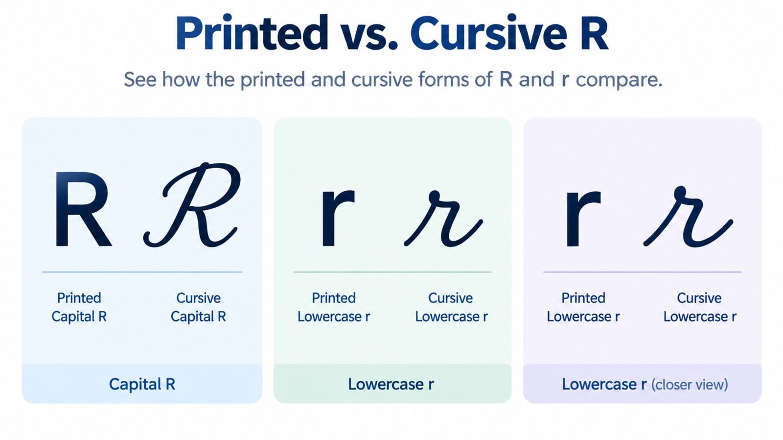
How to Write Cursive R: Uppercase and Lowercase Guide
Cursive R confuses more people than almost any other letter in the alphabet because the connected script version barely resembles the printed R most of us learned first. Where print R has a straight vertical line, a closed loop and a kicked-out leg, cursive R trades all of that for a small peaked hump on the lowercase form and a rounded shoulder on the capital that looks closer to a cursive P than anything else. If you have ever stared at a signature or an old letter and wondered where the R went, you already know the problem. This guide walks through the exact strokes for both lowercase r and capital R, shows how the letter connects inside real words, flags the mistake almost everyone makes when they first learn it and gives you a fast way to see your own name rendered in cursive r using a handful of real script fonts.
New to cursive? Start with the complete beginner’s guide before diving into this one letter.
Why Cursive R Looks So Different From Print R
Most cursive letters keep at least a rough outline of their print shape. Cursive A still has a loop, cursive S still curves the same direction and cursive T still crosses near the top. R is one of the few letters that breaks that pattern almost completely.
The reason comes down to connection. Cursive writing is built so a pen never lifts between letters inside a word. The printed capital R, with its closed loop and separate diagonal leg, does not flow into the next letter without an awkward stop. Handwriting systems that developed cursive alphabets, including the Palmer Method and the earlier Spencerian style, replaced that closed loop with a single continuous stroke: a tall upstroke, a small rounded bump near the top and a diagonal line that carries straight into the next letter.
The lowercase r went through an even bigger change. Instead of the vertical stem and short arm of a printed r, cursive lowercase r shrinks down to a short upstroke that ends in a small pointed peak, almost like a tiny checkmark sitting on the baseline. That peak is the entire identity of the letter and it is also the part beginners get wrong most often.
A Short History of Why This Shape Stuck
The modern cursive R is not an arbitrary design choice. It comes from centuries of handwriting instruction built around speed. Copperplate script, developed in England for engraving and formal correspondence, gave the capital R a looped, ornamental top with heavy shading on the diagonal leg. When American schools standardized handwriting instruction in the late 1800s, the Spencerian method carried that same rounded top forward but simplified the flourishes for everyday writing.
The Palmer Method, introduced in the early 1900s and taught in most American classrooms for decades afterward, stripped the letter down even further. Palmer’s version of capital R kept the rounded bump and the diagonal leg but removed most of the ornamental entry and exit strokes, since the entire point of the method was to let students write faster with less arm fatigue. Zaner-Bloser and other twentieth century handwriting programs made small adjustments of their own. Still, the core bones of the letter, a tall stem, a rounded shoulder and a diagonal leg for capital R, a short peaked upstroke for lowercase r, stayed remarkably stable across all of them. That is why the letter you learned in a 1970s classroom and the letter taught in a modern cursive workbook still look closely related.
How to Write Lowercase Cursive r
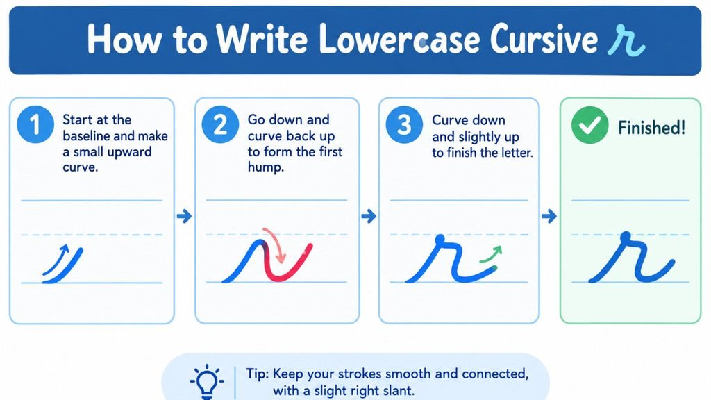
Lowercase cursive r is one of the shortest letters in the entire cursive alphabet, which is exactly why it trips people up. There is very little room for error in a letter this small.
- Start on the baseline and pull a short, straight stroke up toward the midline, the same entry stroke you would use for cursive i or cursive u.
- About two thirds of the way up, curve the stroke into a small, sharp peak that points up and slightly to the right. This peak should sit close to the midline, not above it.
- Bring the stroke back down to the baseline in a smooth curve, landing in position to connect straight into the next letter.
- Keep the whole shape compact. A well formed lowercase r should be noticeably shorter than a lowercase l or a lowercase t.
The single detail that separates a clean lowercase r from a sloppy one is the sharpness of that peak. A rounded hump instead of a pointed one turns the letter into something that reads as an n, which is the single most common mix-up in cursive handwriting. Practicing the peak in isolation, writing a row of nothing but the up-stroke and peak before adding the connecting strokes on either side, fixes this faster than writing full words.
How to Write Uppercase Cursive R (Capital R)
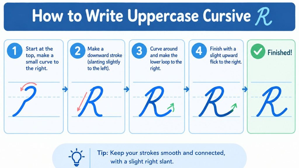
Capital R is the more dramatic departure from print and it is the letter that generates the most searches from people trying to confirm they are writing it correctly.
- Begin below the baseline with a small entry loop, then pull a tall, straight downstroke from the top line to the baseline, similar to the stem you would use for a cursive capital P or capital B.
- Without lifting the pen, retrace part of that stem back upward and curve it into a rounded bump near the top of the letter. This bump sits on the right side of the main stem and should stay compact rather than ballooning outward.
- From the bottom of that bump, add a diagonal stroke that angles down and to the right, ending at or just below the baseline. This diagonal is the leg of the R and the part most often left out by beginners copying the letter from memory.
- Finish the diagonal with a small flick that carries into the next letter if R starts a word that continues in cursive, otherwise lift the pen cleanly once R stands alone.
The result should look like the top half of a cursive capital P with an extra diagonal stroke added at the base. That resemblance is not a coincidence. Several cursive systems teach P, R and sometimes B as a related family of letters because they share the same tall stem and rounded top.
Cursive R Versus Cursive N: Avoiding the Most Common Mix-Up
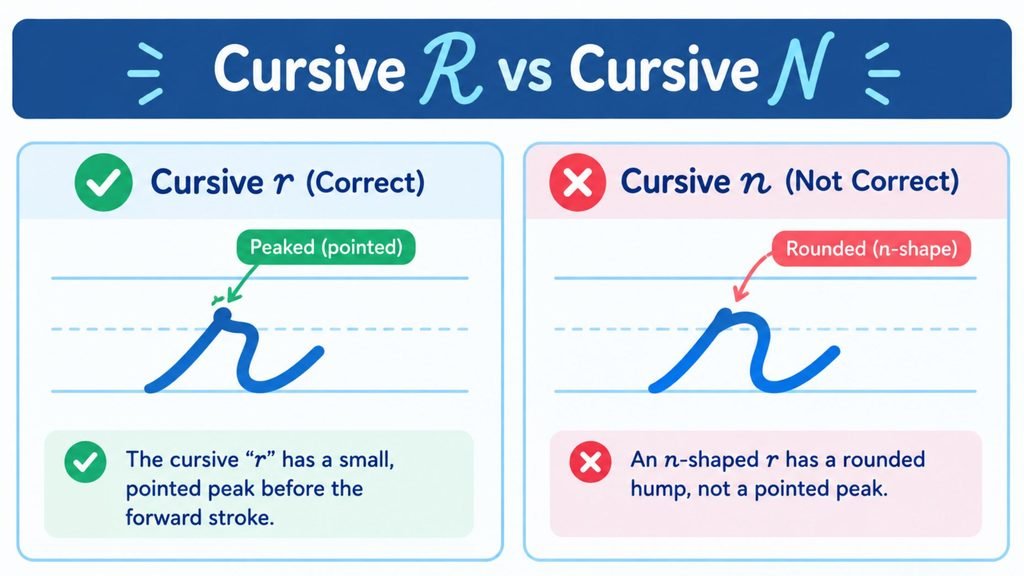
Ask any handwriting teacher which lowercase cursive letter gets confused for another the most and cursive r comes up almost every time. The culprit is that single peak.
Lowercase cursive n is built from two rounded humps of roughly equal height. Lowercase cursive r is built from one short upstroke and one sharp peak. When someone writes the peak too high, rounds it off instead of keeping it pointed or drags the second stroke out into a second hump, the r starts to look exactly like an n.
Three quick fixes:
- Keep the peak below the midline. A peak that reaches full midline height starts to read as the first hump of an n.
- Make the top of the peak sharp rather than curved. A rounded top is the single biggest giveaway of an n-shaped r.
- Compare the letter in context. Writing “run” and “nun” side by side and checking that the r versions are visibly shorter and sharper than the n versions is a fast way to catch the habit before it sets in.
This mix-up shows up constantly in real handwriting, including in personal signatures, which is why so many people search for confirmation on what a correct cursive r is supposed to look like in the first place.
Connecting R to Other Letters
Cursive letters rarely appear alone. Inside real words, r has to connect cleanly on both sides and the exit stroke changes slightly depending on what comes next.
Before a letter that starts low, such as a, c, e or o, the r’s peak flows directly down into the start of that letter with no extra movement needed. Before a letter that starts with a tall upstroke, such as l, b or h, the exit from r needs to sit a little higher so the transition does not look cramped. At the end of a word, the final stroke of r can extend into a small closing flourish, though many modern cursive styles keep that flourish minimal or drop it entirely for a cleaner, more legible finish.
Double r, as in words like “carry” or “berry,” is written as two separate r shapes joined by a short connecting stroke rather than one exaggerated letter. Trying to merge them into a single wide shape is a common shortcut that makes the word harder to read rather than easier.
See Your Name Written in Cursive R
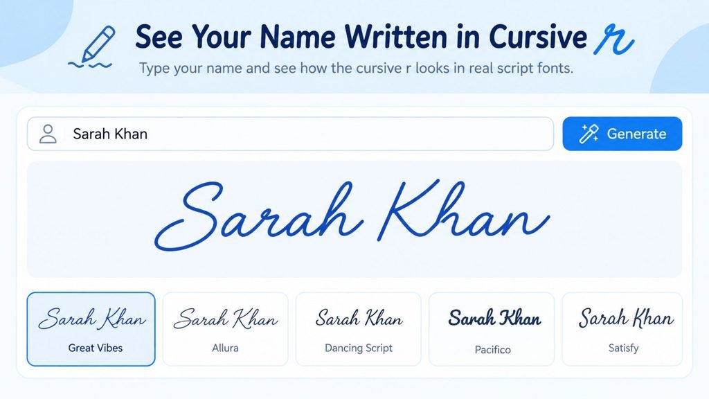
Reading stroke instructions only goes so far. The fastest way to understand how capital and lowercase cursive r actually behave inside a real word is to see them rendered in an actual script typeface rather than imagined from a diagram.
Cursive Generator recreates typed text using genuine cursive characters. Its preview section shows the same input rendered across several real script fonts side by side, so you can compare how the peak on a lowercase r or the bump on a capital R shifts between a tighter, more formal script and a looser, more casual one. Typing a name or word that includes the letter R is one of the quickest ways to see the strokes described above in a finished, legible form rather than a step-by-step diagram.
Cursive R Across Different Script Styles
| Style | Lowercase r shape | Capital R shape |
| Spencerian | Narrow peak, more ornamental entry stroke | Wide rounded top with a pronounced flourish |
| Palmer Method | Compact, low peak, minimal flourish | Simple rounded bump, shorter diagonal leg |
| Modern casual script | Very short peak, sometimes simplified further | Rounded top closer to a capital P shape |
| Copperplate calligraphy | Sharp, formal peak with thick and thin line contrast | Elaborate looped top with heavy shading on the diagonal |
Differences like these are exactly why a single “correct” cursive R does not exist. Every historical handwriting system made its own small adjustments to the same basic stroke pattern and modern script fonts inherit those differences.
Handwritten Practice Versus Typed Previews
Both approaches serve a different purpose. Using them together usually gets people comfortable with the letter fastest.
Handwritten practice, whether on ruled paper or a printable tracing worksheet, is what actually builds the muscle memory needed to write cursive r automatically without thinking through each stroke. There is no substitute for repetition with an actual pen or pencil when the goal is handwriting fluency.
A typed preview, on the other hand, is the faster way to study the finished shape before picking up a pen. Seeing capital and lowercase r rendered cleanly and consistently across several real fonts removes the guesswork of trying to interpret a single static diagram. It is also a useful reference to keep open on a second screen while practicing by hand. Neither approach replaces the other. Reference the typed version to confirm what the letter should look like, then reinforce it with handwritten repetition until the stroke feels automatic.
Tips for Practicing Cursive R
Getting comfortable with cursive r usually takes less time than people expect once the peak-versus-hump distinction clicks.
- Practice the peak in isolation first. Write a full line of nothing but the entry stroke and peak, without connecting into a full letter, until the shape is consistent.
- Slow down on the capital’s diagonal leg. Most rushed capital R letters lose the leg entirely and end up looking like a cursive capital P instead.
- Write r inside real words, not just on its own. The letter behaves differently depending on what comes before and after it, so isolated practice only gets you halfway there.
- Compare your r against printed reference material regularly rather than relying on memory, since the peak height is easy to drift upward over a page of writing without noticing.
- Trace before you write freehand. Tracing several rows of both the lowercase and capital forms builds muscle memory faster than jumping straight to freehand practice.
- Keep a consistent pen angle. A shifting grip changes how thick the diagonal leg on capital R looks from one attempt to the next, which makes it harder to judge whether the shape itself is actually improving.
Frequently Asked Questions
How do you write a lowercase r in cursive?
Start on the baseline, pull a short upstroke to about two thirds of the way to the midline, curve it into a small sharp peak and bring the stroke back down to the baseline in one smooth motion. The peak should stay below the midline and end in a point rather than a rounded curve.
Why does cursive r look like an n sometimes?
It happens when the peak in lowercase r gets rounded off or raised too high, which makes it resemble the first hump of an n. Keeping the peak sharp and compact and comparing the letter directly against a written n is the fastest way to stop the two from blending together.
What does a capital R look like in cursive?
Capital R starts with a tall downstroke, retraces upward into a rounded bump near the top that resembles the top of a cursive P, then adds a diagonal leg that angles down to the baseline. The combination of the rounded top and the diagonal leg is what distinguishes it from a capital P.
Is cursive R written the same way in every handwriting style?
No. Spencerian script adds more ornamental flourishes to both the lowercase and capital forms. The Palmer Method simplifies the letter for speed and legibility, while modern casual scripts shrink the peak and the bump even further. The core stroke pattern, an upstroke and peak for lowercase and a downstroke, bump and leg for capital, stays consistent across all of them.
Why do some people’s cursive R signatures look nothing like the textbook version?
Signatures develop through years of repetition and personal shortcuts, so most adults’ cursive R drifts from the textbook stroke pattern over time. A rushed capital R often loses its diagonal leg entirely or flattens into a single loop, while a rushed lowercase r can lose its peak and collapse into a straight line. That drift is normal and does not mean the original letter was learned incorrectly.
Conclusion
Cursive R is one of the few letters where knowing the print version genuinely does not help, since the connected form was rebuilt from scratch for speed and flow rather than for resemblance. Once the lowercase peak and the capital’s rounded bump with its diagonal leg become familiar, the letter stops being a source of confusion and turns into one of the faster letters to write in the entire cursive alphabet. If you want to see the finished shape before committing it to paper, type a word or your own name into Cursive Generator and compare how capital and lowercase r look across several real script fonts in the preview section.
Related letter guide: How to Write Cursive I covers the same style comparison and stroke-by-stroke approach for the letter I, including the dot placement mistake that trips up most beginners.
5 Comments