
How to Write in Cursive: A Complete Beginner’s Guide
Learning how to write in cursive comes down to a handful of habits, not raw talent. Most people pick up the core motion faster than they expect once those habits click. The letters themselves are only part of the story. Posture, pen angle, slant and the way one letter flows into the next matter just as much as knowing what each shape looks like. This guide walks through what cursive actually is, the alphabet’s overall shape, a step-by-step method for learning it from scratch, the mistakes that slow most beginners down and where to go next once the basics feel comfortable.
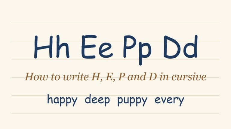
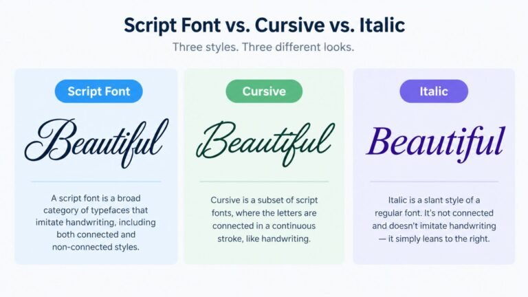
Looking for cursive text to copy and paste instead of handwriting it yourself? See Cursive Font Copy and Paste: How It Actually Works for how that digital trick works and where it does and doesn’t display correctly. Not sure cursive is even the word you’re looking for? Script Font vs. Cursive vs. Italic: What’s the Difference sorts out how those three terms actually relate. Want every lowercase letter laid out a to z? The Cursive Alphabet: A-Z Lowercase and Capital Letters Chart has the full reference. For the trickiest letters, see How to Write F, S, Z and J in Cursive, and for g, k, a and n see how to write G, K, A and N in cursive. For b, l, m and t see how to write B, L, M and T in cursive, and for h, e, p and d see how to write H, E, P and D in cursive.
What Cursive Writing Actually Is
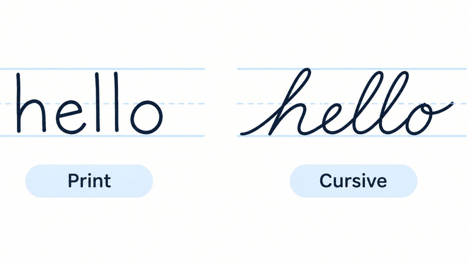
Cursive writing is a style of handwriting where the letters within a word connect in a single, continuous motion instead of being lifted and placed one at a time the way print letters are. That connection is the entire point. A skilled cursive writer rarely lifts the pen in the middle of a word, which is what allows cursive to be written noticeably faster than print once the motion becomes automatic.
This is different from calligraphy, which uses controlled pressure and specialized tools to produce decorative, varied-width strokes, usually for a single finished piece rather than everyday writing. Cursive is meant to be practical. Speed and flow matter more than ornamentation, even though certain cursive styles, like Spencerian script, do add decorative flourishes on top of the functional connected strokes.
The Cursive Alphabet: What Makes It Different From Print
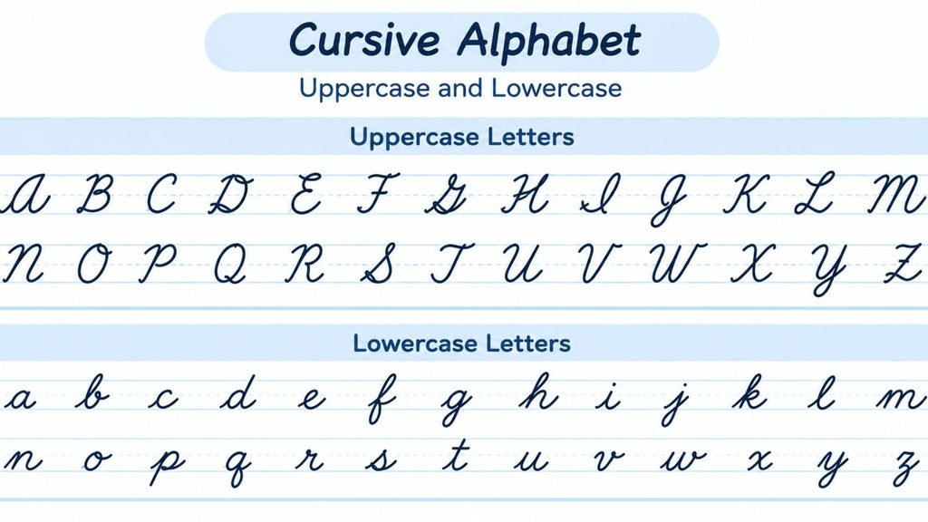
Most lowercase cursive letters keep a rough resemblance to their print shape, just softened and connected. Lowercase cursive a, c, e and o still look recognizably like their print versions with a small entry or exit stroke added. A handful of lowercase letters change more noticeably. The capital alphabet changes even more.
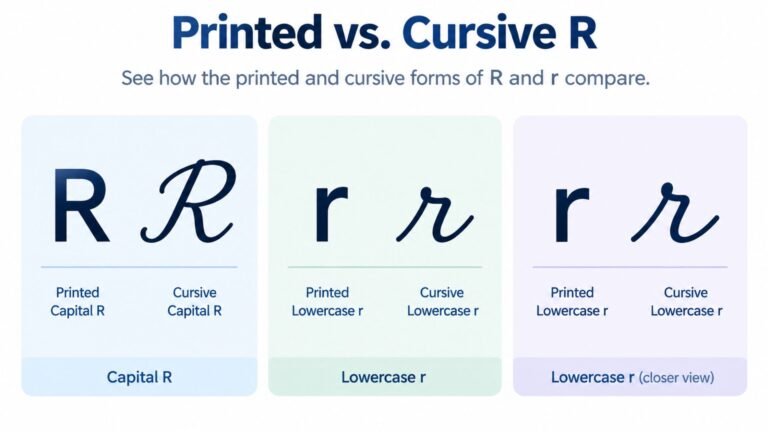
Capital cursive letters are where beginners hit the steepest learning curve. Several capitals, including I and, to a lesser extent, letters like R and J, were built around ornamental loops carried over from historical handwriting systems like Spencerian and Copperplate script rather than shaped to resemble their block-letter print counterparts. A capital I in cursive looks like a tall, narrow loop rather than a straight vertical line. A capital R keeps only the faintest resemblance to its print shape, trading the closed loop and separate leg for a single continuous stroke that looks closer to a cursive P with an added diagonal.
For the full breakdown of all 26 capitals, not just the two covered here, see How to Write Capital Cursive Letters: A-Z Guide.
This is worth knowing upfront because it changes how you should practice. Lowercase letters can mostly be learned as a group, since the underlying strokes repeat across many of them. Capital letters are better learned individually, since each one tends to have its own specific shape and its own specific point where beginners go wrong.
Print Versus Cursive at a Glance
| Feature | Cursive | |
| Letter connection | Each letter lifted and placed separately | Letters flow together in one continuous motion |
| Writing speed once learned | Moderate | Faster, once the motion is automatic |
| Learning curve | Lower, closer to how most people first learn to write | Higher, especially for ornamental capitals |
| Where it still shows up | Forms, labels, most everyday writing | Signatures, formal correspondence, journaling, handwritten notes |
Neither style is objectively better. Print is easier to learn first and easier for most people to read quickly, which is why it remains the default for early education. Cursive trades a longer learning curve for speed and a distinct, more personal look, which is why it survives mainly in signatures and handwriting people choose to keep using deliberately rather than out of necessity.
Tools That Make Learning Easier
The right tools will not replace practice. A few of them do make the learning curve noticeably shorter.
A pen that flows smoothly without catching matters more in cursive than in print, since a snagging pen breaks the continuous motion that the whole style depends on. A rollerball or gel pen tends to work better for beginners than a ballpoint, which can require more pressure and interrupt the flow between strokes.
Lined paper with a midline, not just a baseline, is worth seeking out while learning. Most standard ruled paper only marks the baseline and the top of the line, leaving the midline, where many lowercase letters peak, up to guesswork. Specialty handwriting paper with a dotted or lighter midline removes that guesswork during the early stages.
A tracing worksheet is useful for building the muscle memory behind a specific letter’s shape. It should not replace freehand practice entirely. Tracing teaches the correct motion. Freehand writing is what proves the motion has actually been learned rather than just copied.
How to Write in Cursive: A Step-by-Step Method
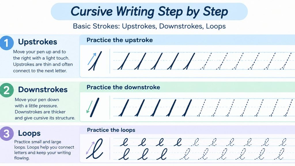
There is no shortcut around repetition. The order you practice in makes a real difference in how fast the skill develops.
- Start with basic strokes, not letters. Practice straight upstrokes, downstrokes, small loops and the connecting curve between them on their own, without trying to form a letter yet. This builds the muscle memory that every letter is built from.
- Learn lowercase letters in shape families rather than alphabetical order. Letters like i, u and w share the same basic upstroke. Letters like n, m and h share the same rounded hump. Grouping practice this way reinforces the underlying motion instead of treating each letter as a brand new shape to memorize.
- Move to capital letters one at a time, starting with the ones you actually need for your own name and the words you write most often. Capitals take longer to feel natural, so isolate practice on a single capital until it is consistent before adding another.
- Practice connecting letters into short, common words before attempting full sentences. A two or three letter word forces you to handle entry and exit strokes correctly without the added pressure of a long sentence.
- Slow down before you speed up. Cursive only saves time once the strokes are automatic. Rushing before the motion is consistent just produces fast, illegible handwriting instead of fast, legible handwriting.
- Write full sentences last, once individual letters and short words feel comfortable. This is where slant consistency and even spacing become the main things to focus on, rather than the shape of any single letter.
Common Mistakes That Slow Beginners Down
A few habits account for most of the trouble people run into when learning cursive. Almost all of them are fixable once you know to watch for them.
Inconsistent slant is the most common issue in early cursive writing. Letters that lean in different directions within the same word or sentence make the whole page look uneven even when each individual letter is technically well formed. Picking a consistent slant angle and checking it every few words fixes this faster than focusing on any single letter shape.
Letter confusion is the second biggest slowdown. It tends to cluster around specific pairs rather than being random. Cursive r and cursive n get confused when the peak on r rounds off into a hump. Cursive I and cursive J get confused when the downstroke of I curves past the baseline into J’s descender. These mix-ups are common enough that they are worth learning about directly rather than discovering through trial and error.
Rushing the connections between letters is the third common issue. A beginner who has each individual letter down cleanly can still produce messy handwriting if the connecting strokes between letters are inconsistent. Slowing down specifically at the point where one letter ends and the next begins, rather than throughout the whole word, targets this problem directly.
Dotting and crossing letters incorrectly rounds out the list. Going back over a finished word to add every i’s dot or t’s crossbar at once, instead of doing it as you go, is a common shortcut that often misplaces a dot or crossbar over the wrong letter, especially in longer words.
Cursive Words: Connecting Letters Smoothly
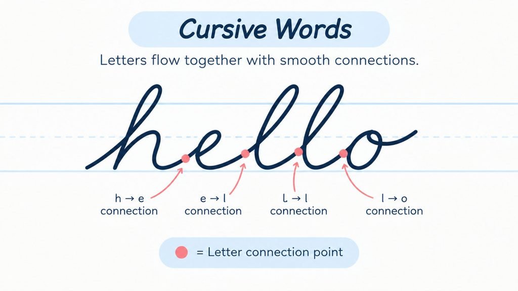
Individual letters are only half the skill. The other half is what happens at the seams between them. That is where cursive earns its reputation for being faster than print.
For the full breakdown, including how different letter pairs connect and the words that trip people up most, see How to Write Cursive Words: Connecting Letters Smoothly.
Most lowercase letters exit at or near the baseline, which makes connecting into the next letter a short, direct stroke. The exit height changes slightly depending on what comes next. A letter followed by another that starts low, like a, c or e, connects with a simple downward curve. A letter followed by one that starts with its own upstroke, like l, b or h, needs the exit stroke to rise slightly so the transition does not look cramped.
Capital letters behave differently. Most cursive styles treat a capital at the start of a word as its own stroke, with a small visual gap before the lowercase letters that follow rather than one unbroken line from the capital straight into the rest of the word. Trying to force a hard connection here is a common cause of a capital letter’s shape collapsing partway through.
Double letters, like the two l’s in “hello” or the two s’s in “class,” are written as two separate letter shapes joined by a short connecting stroke rather than merged into one exaggerated shape. Merging them usually makes the word harder to read, not faster to write.
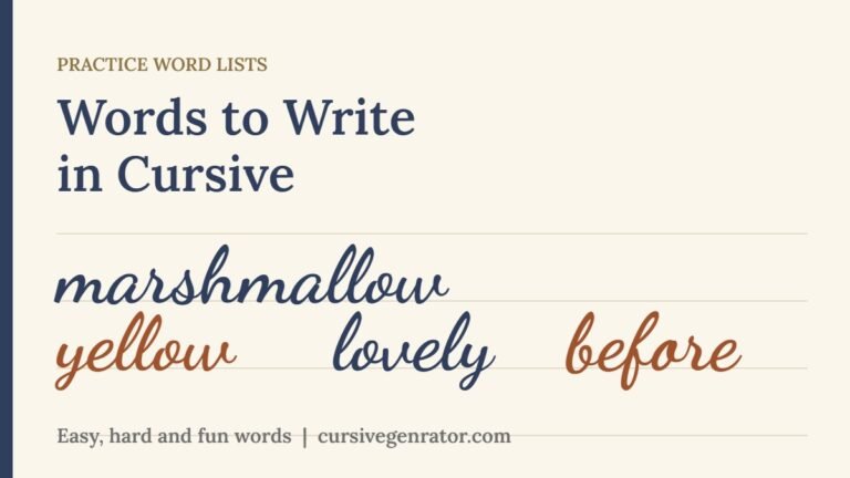
Once the letters feel steady, practice them on real words. The words to write in cursive lists give you easy, hard and fun words to start with.
How Long It Takes to Learn Cursive
There is no fixed timeline, since it depends heavily on how often you practice and how much handwriting experience you already have. A rough pattern shows up consistently. Lowercase letters and short, common words usually start to feel comfortable within a few weeks of short, regular practice sessions. Capital letters, especially the more ornamental ones like I and R, typically take longer, since each one needs its own dedicated attention rather than benefiting from grouped practice the way lowercase letters do. Full sentence writing at a natural, legible speed is usually the last piece to click, since it depends on slant consistency and spacing holding steady over many words in a row, not just on knowing individual letters.
Short, frequent practice sessions consistently outperform long, infrequent ones for this particular skill. A few focused minutes most days builds the muscle memory that cursive depends on far more effectively than an occasional long session, since handwriting is a motor skill first and a visual one second.
See Your Own Writing in Cursive First
Before committing pen to paper, it helps to see exactly what the finished letters and words should look like, especially for the capital letters that depart the furthest from print.
Cursive Generator converts typed text into genuine cursive characters and previews it across several real script fonts at once. Typing your own name or a short sentence is a fast way to study proportions, slant and connection points before practicing them by hand. It is also a useful reference to keep open while you work through the steps above.
Letters That Trip Up Most Beginners
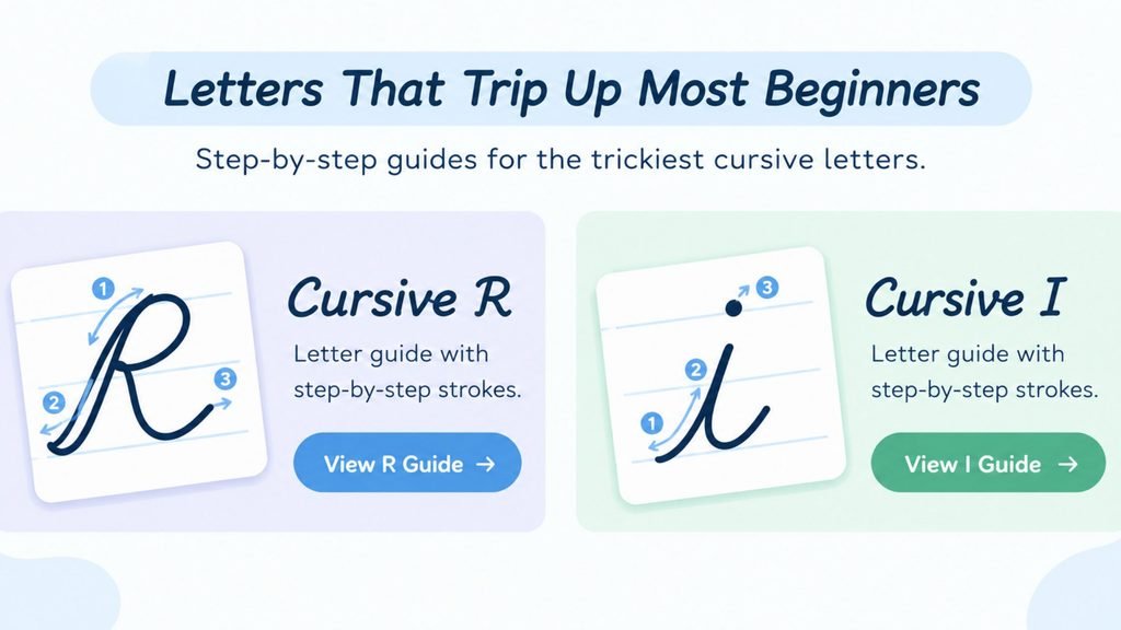
Two capital letters account for a disproportionate share of the confusion beginners run into. Both are worth learning in detail rather than picking up by trial and error.
Want the complete picture first? How to Write Capital Cursive Letters: A-Z Guide walks through all 26 capitals, including the two below, plus the letter pairs (I/J, R/N, Q/2 and T/F) that get confused most often.
Capital R is one of the biggest departures from its print shape in the entire alphabet. It also gets mixed up with cursive n far more often than any other letter pair. The full stroke-by-stroke breakdown, along with the R-versus-N mix-up and how to avoid it, is covered in How to Write Cursive R.
Capital I splits into two completely different problems: a lowercase form that is simple but easy to dot incorrectly, plus a capital form that loops so far from print that it regularly gets mistaken for a J. The complete guide to both forms, including the I-versus-J mix-up, is covered in How to Write Cursive I.
Numbers cause a different kind of trouble, since cursive digits do not connect to each other the way letters do. For the specific rules that apply to each digit, plus the number pairs that get confused most often, see How to Write Numbers in Cursive.
Frequently Asked Questions
How do you write in cursive if you have never learned it before?
Start with basic strokes rather than full letters, group lowercase letters by shared shape, then move to capital letters one at a time before connecting everything into short words and eventually full sentences. Short, frequent practice sessions work better than occasional long ones.
How do you write cursive letters neatly?
Consistency matters more than speed at first. Pick a single slant angle and hold it across every letter, keep connecting strokes smooth rather than rushed, then add dots and crossbars as you go rather than sweeping back over a finished word to add them all at once.
How is cursive writing different from print?
Print letters are formed separately with the pen lifted between them. Cursive letters connect within a word in one continuous motion, which is what makes cursive faster to write once the motion becomes automatic, though it takes more upfront practice to learn than print does.
How do you do cursive if your handwriting is already print-based?
The habits transfer more than you might expect. Slant, spacing and pen pressure work the same way in both styles. The main adjustment is learning to keep the pen moving between letters instead of lifting it, which is best practiced on short, common words before attempting full sentences.
Why do some cursive capital letters look nothing like their print version?
Several cursive capitals, especially I and R, were shaped by historical handwriting systems like Spencerian and Palmer Method script that prioritized a continuous, flowing stroke over resembling printed type. The ornamental loops on those letters exist because they let the pen keep moving, not because anyone tried to make them look like a printed I or R.
Is cursive still taught in schools?
It varies widely by school and region. Coverage has become far less consistent than it once was, which is exactly why so many people end up learning or relearning cursive as adults, outside a classroom setting, using guides and practice sheets rather than formal instruction.
Conclusion
Cursive writing is a motor skill built from a small set of repeatable habits: consistent slant, smooth connections between letters and a handful of capital letters that need individual attention. Once those pieces are in place, the rest of the alphabet tends to fall into place quickly. Start with the basic strokes, work through lowercase letters as a group, then tackle the two capitals that cause the most trouble using the dedicated guides above. To see how your own name or a favorite word looks before writing it by hand, try Cursive Generator and preview it across several real script fonts.
12 Comments