
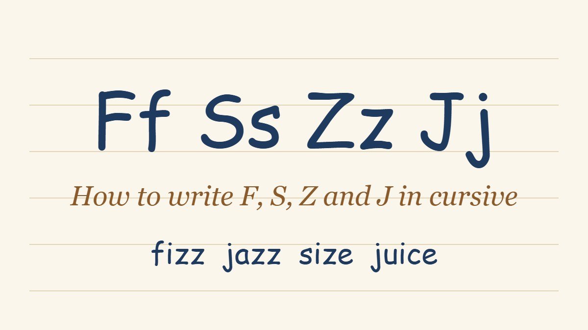
How to Write F, S, Z and J in Cursive (Lowercase and Capital)
Most cursive letters are easy to guess once you have seen a few of them. F, S, Z and J are the exceptions. Each one breaks a habit the other letters build: f is the only common letter that has a loop both above and below the line, s changes shape completely from print, z is rarely taught well because it is rare in words, and j drops a tail below the line like f does while also needing a dot. That is why searches for cursive f, cursive s, cursive z and cursive j are so common.
This guide shows how to write each of the four, lowercase and capital, with the stroke path in plain steps and the mistake to watch for. If you are still learning the basic shapes, start with the full guide to writing in cursive or the cursive alphabet chart, then come back here for the harder letters. The next set of letters is covered in how to write G, K, A and N in cursive, and for b, l, m and t see how to write B, L, M and T in cursive, or for h, e, p and d see how to write H, E, P and D in cursive.
Why F, S, Z and J Are the Hard Letters
Easy cursive letters stay inside the writing space between the baseline and the midline. The letters a, c, e, i, m, n, o, u and w all do this. The four letters in this guide do something different.
F and J travel through all three zones: above the midline, between the lines, and below the baseline. S is small, but its shape is unlike its print form, so there is nothing to copy from memory. Z has two common forms, and many learners never see either of them in daily life, because z is among the least frequent letters in English.
The good news is that all four are built from strokes you already know. The tall loop of an l, the downstroke and exit of an i, and the oval start of an a cover almost every part. Learning these letters is mostly a matter of putting known strokes in a new order.
The Lines You Need First
Before the individual letters, it helps to have the lines straight. Cursive paper has a baseline, a midline above it and a top line above that. Lowercase letters such as s and z sit between the baseline and the midline. Tall letters such as f reach the top line. Letters with tails, such as f, j and z in its looped form, drop below the baseline by about the same distance that tall letters rise above it.
Keep one slant throughout. Most modern cursive models lean the letters about 15 to 20 degrees to the right. If you draw light slanted lines across your page, every loop and downstroke in this guide has something to follow. Most of the problems learners report with these four letters turn out to be slant problems, not shape problems.
How to Write Lowercase F in Cursive
Lowercase f is the most distinctive letter in the alphabet. It has a tall loop on top and a second loop below the line, and the two are joined by one straight stroke that passes through the baseline.
- Step one: Start at the baseline and swing up and to the right in a curve, rising all the way to the top line.
- Step two: Curve over the top to the left, then come straight down in one long slanted stroke. This stroke passes the baseline, crosses the writing space and keeps going until it is as far below the line as the top of the f is above it.
- Step three: At the bottom, curve the stroke to the left and bring it back up, crossing the long downstroke at the baseline. This makes the lower loop.
- Step four: Finish with an upward exit stroke to the right, which carries the pen into the next letter.
The crossing point at the baseline is what makes an f look like an f. If the two strokes cross higher or lower, the letter reads as an unfinished l or an elongated g. The loop above and the loop below should be close to the same size.
A printed f needs a crossbar, but a lowercase cursive f does not, because the crossing of the two loops does that job. Some handwriting models add a short horizontal bar through the stem, mostly for decoration. Both are accepted.
The most common problem is a top loop that is too small, which makes the letter look squashed. Give it the same room as an l.
How to Write Lowercase S in Cursive
Lowercase cursive s is small and quick, and it has nothing in common with a printed s. It looks like a short peak with a flat base and a small tail, closer to a tiny tent than a curve.
- Step one: Start at the baseline with a short upward stroke, rising to the midline.
- Step two: Reach a small point at the top, then curve back down to the left in a short stroke, ending just above the baseline.
- Step three: Close the base with a tiny curve and exit upward to the right, joining the next letter.
That is the whole letter. It should stay between the baseline and the midline, the same height as an a or an n. A cursive s that rises above the midline starts to look like an r or a b.
Word-final s is slightly different. At the end of a word there is no next letter to join, so many models end it with a small curved tail, or a short closing stroke instead of the upward exit.
The most common mistake is writing the top as a rounded hump, as in a print s. This produces a letter that reads as an o or a closed a. Aim for a clear point at the top and a clear closed base.
How to Write Lowercase Z in Cursive
Cursive z is the letter learners most often ask about, because two shapes are in use and each is common in different schools. Both are drawn at lowercase height, and both begin with a small curve at the top. The difference is in the base.
The first form is the three-shaped z. It looks like a handwritten 3 with a tail:
- Step one: Start at the midline with a small curved stroke, going to the right.
- Step two: Come back left in a short diagonal stroke down to the baseline, sloping the way the slant of the page does.
- Step three: Curve to the right along the baseline and then, instead of stopping, swing down below the line and loop back to the left to finish.
The second form is closer to the print z:
- Step one: Draw the top as a short horizontal stroke at the midline, going right.
- Step two: Draw the long diagonal down and to the left, ending at the baseline.
- Step three: Finish with a base stroke to the right, with a small upward exit if another letter follows.
Which one you use does not matter much, as long as it is easy to read and used the same way every time. If you are copying a handwriting model from a school or workbook, follow whichever form that model uses.
The most common problem is a z that has the diagonal too steep. This makes the letter narrow and hard to tell from a 2. Keep the diagonal moving at the same slant as the rest of your writing, and keep the top and base the same width.
How to Write Lowercase J in Cursive
Lowercase j is an i with a tail. It starts the same way and then follows the same lower loop as the f.
- Step one: Start at the baseline and make a short upstroke to the midline, exactly as you would for an i.
- Step two: Turn and come straight down in a slanted stroke that crosses the baseline and keeps going below it, as far down as you would go for the lower loop of an f.
- Step three: Curve left at the bottom, then bring the stroke back up, crossing the downstroke at the baseline.
- Step four: Finish with an upward exit stroke to the right.
- Step five: After the letter, or after the whole word, lift the pen and add the dot above it, in line with the downstroke.
The dot is the part people forget, since print j has one too but cursive writing is quick. Add it after the word is finished, not after the letter, so the pen stays on the page while you write.
The common problem with j is that the lower loop is too tight, which makes the tail look like a hook. Give the loop the same width as the loop below an f.
Capital F, S, Z and J in Cursive
Capital cursive letters differ much more from one handwriting model to another than lowercase letters do. The shapes below are the ones most often taught, and any of them is correct as long as the letter reads clearly. Our guide to capital cursive letters covers every capital in detail, and the dedicated pages on how to write cursive R and how to write cursive I follow the same approach.
- Capital F: Starts with a curved stroke across the top and a long curved stem that drops to the baseline. Most models then add a separate horizontal bar through the stem, drawn after the stem is done, which is why the capital F often looks like a decorated T.
- Capital S: Starts with a small upward curl at the baseline, rises to the top line, then sweeps over and back down like a print S, finishing with a rounded base and an upward finish. Keep the two curves of the S about the same width, so the letter does not lean to one side.
- Capital Z: Starts with a curved stroke at the top line, comes down in a diagonal, and finishes with a curved base. Many models loop the base or drop a small tail below the line. It is the capital that most closely resembles its lowercase form.
- Capital J: Starts at the top line with a curved opening stroke, drops straight down through the baseline into the descender zone, loops back and exits up to the right. It looks like a taller version of the lowercase j without the dot.
Capital letters are usually written on their own and do not join to the letter after them, though a small gap is enough. They also stand out more, so slant and size matter more than they do with lowercase letters.
How These Letters Join to Others
Each letter has an exit stroke, and the next letter picks up from there. The four letters in this guide show the main patterns.
- F ends with an upward exit from the base of its lower loop, so it joins to the next letter like an ordinary baseline join. The letter after f starts from the baseline, not from the descender, which is a common source of messy writing.
- S ends with a small upward exit from the baseline. It joins well into vowels such as a, e and o, and into t.
- Z ends with its base stroke or its lower loop, depending on the form. Z is usually the last letter in a short stretch of a word, so the exit matters less than for the other three.
- J ends like f, with an upward exit from the base of the loop, and joins into the next letter at the baseline.
Letters that join into these four matter too. Letters that finish at the top, such as o, v, w and b, send a high exit across, so the next letter has to start from the higher point. For the general rules about how any two letters connect, see the guide to cursive words and connecting letters.
Words to Practice These Letters
Practice each letter alone first, then move to words once the shape feels steady. Good words to start with:
- F: if, off, life, leaf, fish, fun, from, found
- S: is, as, so, sun, sit, said, seen, house
- Z: zoo, zip, size, zero, lazy, jazz, buzz, pizza
- J: joy, jam, jump, jelly, July, enjoy, major, ginger
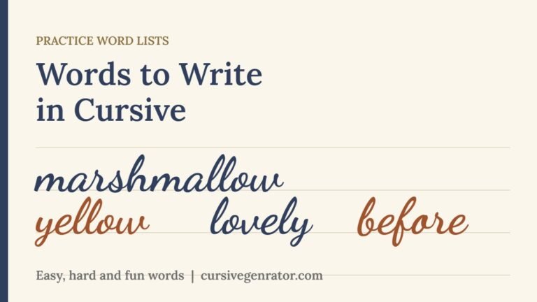
Write each word slowly, ten times, and check that the f and j loops are the same size and that the s and z stay at midline height. For more word lists sorted by what they train, see our page of words to write in cursive.
Common Mistakes
- Making the f loop too small. The upper and lower loops should be about the same size. A tiny top loop turns the letter into an unfinished l.
- Crossing the f at the wrong height. The two strokes must cross at the baseline. A crossing above or below the line changes the shape of the letter.
- Rounding the lowercase s. A print s is rounded. A cursive s has a point at the top and a closed base.
- Making the z diagonal too steep. A steep z looks like a 2. Keep the diagonal on the same slant as the rest of your writing.
- Forgetting the j dot. Add the dot after the word is finished, in line with the downstroke.
- Starting the letter after f or j from the descender. The next letter starts from the baseline, where the loop crosses the line.
A Short Practice Routine
Draw four light slanted lines on a sheet of ruled paper. Then spend a week of short sessions like this.
- Day one and two: Write a full line of lowercase f, then a line of j. Focus on the lower loop and the crossing point.
- Day three and four: Write a line of s and a line of z. Check that every letter stays at the same height.
- Day five: Write the capital versions, one line each, with a small gap before the next letter.
- Day six and seven: Move to words from the lists above, then write one short sentence using all four letters, such as “Jazz fans sip fizzy juice.”
Keep each session to ten or fifteen minutes. Handwriting improves through repetition spread across several days, not through one long session.
See F, S, Z and J in Cursive First
Writing by hand is the goal, but it often helps to see a letter in context before you try it. Cursive Generator converts anything you type into cursive-style text and previews it across several script fonts, so you can type a word like “jazz” or “fizz” and look at how the f, s, z and j connect before writing it on paper. It is a visual reference, not a replacement for practice, and it works well alongside the guide above.
Frequently Asked Questions
How do you write a cursive f?
Start at the baseline, curve up to the top line, then come straight down through the baseline into the descender zone. Loop back to the left and up, crossing the long stroke at the baseline, and finish with an upward exit. A good f has a tall top loop and a lower loop of about the same size.
How do you write a lowercase cursive s?
Start at the baseline with a short upstroke to the midline, make a small point at the top, then curve back down to the baseline and exit upward. It stays at the same height as an a or an n. It looks like a small peak, not a round print s.
How do you write a cursive z?
Two forms are used. The three-shaped z starts with a small curve at the top, comes down in a diagonal, curves along the baseline and drops into a small tail below the line. The print-style z uses a top stroke, a diagonal and a base stroke. Use whichever your handwriting model teaches.
How do you write a cursive j?
Write it like an i with a tail. Make a short upstroke to the midline, come straight down through the baseline into the descender zone, loop back to the left and up, and exit upward. Add the dot above after you finish the word.
Does the cursive f go below the line?
Yes. A lowercase cursive f is the only common letter with a loop above and a loop below the line. The lower loop is about as deep as the top loop is tall.
Is a capital F in cursive the same as lowercase?
No. The capital F is a different shape: a curved top stroke, a long stem and, in most models, a separate bar through the stem. The lowercase f is a double-loop letter that has no separate bar.
Why does my cursive z look like a 2?
Usually because the diagonal is too steep and the base is too short. Keep the top and base about the same width and let the diagonal follow the same slant as the rest of your writing.
Which cursive letters are the hardest to write?
Most learners find f, s, z, j, r and q the hardest. F and j need loops in two zones, s needs a shape that differs from print, and z has two forms. The good news is that all of them become easy after a few days of short practice.
Conclusion
F, S, Z and J are harder than other cursive letters, but each one is built from a small set of strokes you already know. Keep the f and j loops the same size, keep s and z at midline height, learn the capitals as separate shapes, and add dots and crossbars after the word is finished. A week of ten-minute sessions is enough to make all four feel natural. To preview how any word looks across real script fonts before writing it by hand, try Cursive Generator.

4 Comments