
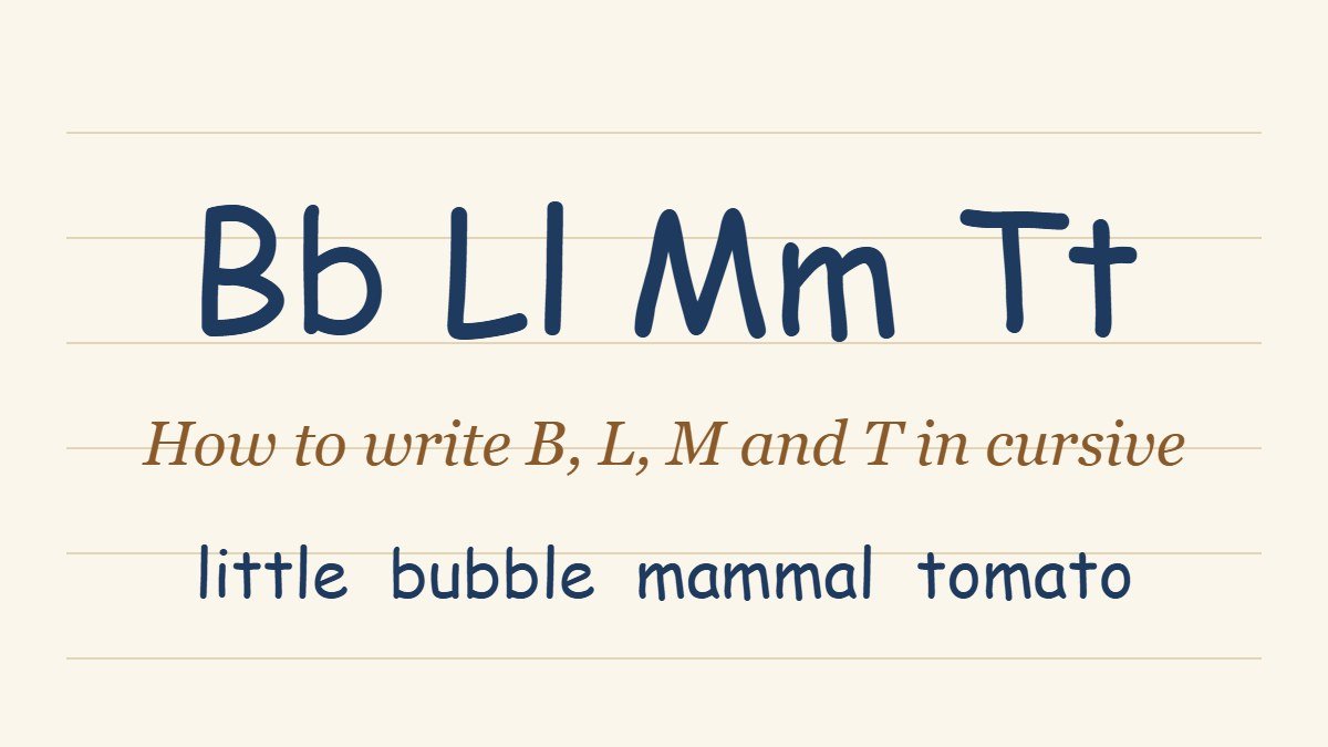
How to Write B, L, M and T in Cursive (Lowercase and Capital)
B, l, m and t are four of the most common letters in English words, and they are also four letters where small mistakes show up fast. A b that does not turn into its bowl reads as an l. An l that is too short looks like an e. An m with only two humps becomes an n, and a t that is as tall as an l loses its identity completely. This guide shows how to write cursive b, l, m and t, lowercase and capital, with the stroke path in plain steps and the mistake to watch for in each. If you are still learning the basic shapes, start with the full guide to writing in cursive or the cursive alphabet chart. If you have already covered the other letter guides, you may also want how to write F, S, Z and J in cursive and how to write G, K, A and N in cursive. For h, e, p and d, see how to write H, E, P and D in cursive.
What Sets B, L, M and T Apart
These four letters are built from different shapes, and each one teaches a different skill.
B and l are tall-loop letters. They begin with the same upstroke and loop, and they share that start with h and k. The difference is what happens at the baseline: l simply finishes and exits, while b swings forward into a small bowl.
M is a hump letter, a cousin of n. Where n has two humps, m has three, so the rhythm of the stroke is the same and only the count changes.
T is a short-stem letter. It rises above the midline but nowhere near the top line, and it is the only one of the four that needs a crossbar added after the letter is finished.
Because each letter practices a different movement, writing them together is useful. A line of l trains tall, even loops, a line of m trains rhythm, a line of b trains the turn into a bowl, and a line of t trains controlled height.
The Heights to Keep in Mind
Cursive writing sits on four reference lines: the baseline, the midline, a line about halfway between the midline and the top, and the top line. Lowercase m sits between the baseline and the midline. T rises to the halfway line, and b and l rise to the top line.
Most of the problems with these four letters are height problems. A t that reaches the top line looks like an l, and an l that stops at the halfway line looks like a t. Keep one slant across the page too, usually 15 to 20 degrees to the right, so every downstroke runs parallel to the others.
Every lowercase letter here finishes with an exit stroke at the baseline, except b, which finishes higher. That exit is what carries the pen into the next letter.
How to Write Lowercase B in Cursive
Lowercase cursive b is the most distinctive of the four. It starts like an l and ends with a bowl, and its exit stroke leaves from the top of the bowl, not from the baseline.
- Step one: Start at the baseline and swing up into a tall loop, rising to the top line, exactly as you would for an l.
- Step two: Come straight down along the slant to the baseline, retracing the stem.
- Step three: Without lifting the pen, curve up and to the right to form a small bowl that rises to the midline.
- Step four: Finish with a short horizontal exit stroke at the midline, which carries the pen into the next letter.
That last step matters. Because b exits at the top, the letter after it has to begin from the midline, not from the baseline. In a word like “bed” or “bubble,” this high exit is the feature that makes the word look right.
Some handwriting models close the bowl all the way back to the stem, and some leave it open as a loose curve. Both are accepted, as long as your b is clearly different from an l.
The most common problem is a bowl that is too small or too flat. Give it about the same width as an o.
How to Write Lowercase L in Cursive
Lowercase l looks like the easiest letter in the alphabet, and it is, but it is also the letter that sets the height for everything else. A good l is a tall, narrow loop with a clean downstroke.
- Step one: Start at the baseline and swing up and to the right in a smooth curve toward the top line.
- Step two: Curve over the top to the left and come back down along the same slant to the baseline. The loop at the top should be narrow, not round.
- Step three: Finish with a small upward exit stroke to the right, so the letter joins the next one.
The loop is the part to protect. It should be tall and slim, about two or three times as high as an a. A wide, round loop turns the l into something like an e, and a loop with no opening looks like a stick with a hook.
Double l is common in English, in words like “hello,” “little” and “yellow.” Write the second l as a fresh letter that starts where the first one ended, and make sure both reach the same height.
The most common problem is uneven loops, with one l taller than the other. Draw a light guide line at the top line to check.
How to Write Lowercase M in Cursive
Lowercase m is three humps in a row. It is wider than any other letter in this guide, so the main task is keeping the humps even.
- Step one: Start at the baseline with a short upstroke, rising to the midline.
- Step two: Curve over to make the first hump and come straight down to the baseline.
- Step three: Retrace up to the midline, curve over again for the second hump, and come down to the baseline.
- Step four: Retrace up a third time, make the third hump and come down.
- Step five: Finish with a small upward exit stroke to the right.
Count the humps as you write: one, two, three. It sounds basic, but an m with two humps is an n, and learners often drop one without noticing, especially when writing fast.
All three humps should be the same height and width, and the downstrokes should be parallel. If the third hump is narrower, the letter looks squeezed at the end.
The most common problem is a cramped m, with the humps too close together to see. Leave a little more room than feels natural.
How to Write Lowercase T in Cursive
Lowercase t is short, simple and easy to get wrong. It needs a precise height and a crossbar added in a second step.
- Step one: Start at the baseline with a short upstroke that rises above the midline, to about halfway between the midline and the top line.
- Step two: Come straight back down the same slant to the baseline.
- Step three: Finish with a small upward exit stroke to the right.
- Step four: After the word is finished, lift the pen and draw a short horizontal crossbar through the stem, at the height of the midline or just above it.
The height is what makes a t a t. Stopping at the midline makes the letter look like an i without a dot. Rising to the top line makes it look like an l. About halfway between is right.
Add the crossbar after the whole word is written, not after the letter, so that the pen stays on the page while the word is written. A small slightly upward slant on the bar looks natural, and many writers extend it toward the next letter.
The most common problem is a crossbar that floats beside the stem instead of crossing it. Aim the bar through the middle of the stem.
Capital B, L, M and T in Cursive
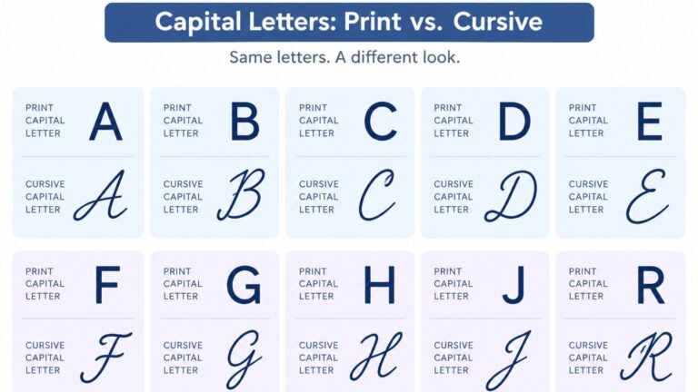
Capital cursive letters differ much more from one handwriting model to another than lowercase letters do. The shapes below are the ones most often taught, and any of them is correct as long as the letter reads clearly. Our guide to capital cursive letters covers every capital in detail, and the dedicated pages on how to write cursive R and how to write cursive I follow the same approach.
- Capital B: Starts with a small curl at the top, drops a long stem to the baseline, then rises back along the stem and adds two bowls to the right, one above the other, ending with a small tail. It is the most print-like of the four capitals.
- Capital L: Starts with a large loop at the top and sweeps down in a long curve to the baseline, finishing with a loop or a curved base that extends to the right. It looks like a bigger, more decorated version of the lowercase l.
- Capital M: Starts with a small curl at the top left, comes down, rises into a first hump, comes down again, and rises into a second hump that finishes with a downstroke and a small exit or tail. Some models write it with pointed peaks, and some with rounded ones.
- Capital T: Starts with a curved stroke at the top, often with a small loop at the left, then drops a stem to the baseline. Many models draw the top bar as a separate stroke after the stem, which gives the capital T a flat roof.
Capital letters are usually written on their own and do not join to the letter after them, though a small gap is enough. They also stand out more, so size and slant matter more than they do with lowercase letters.
How These Letters Join to Others
Each letter has an exit stroke, and the next letter picks up from there. These four show the two main types of join.
- B ends with a high exit at the midline. The next letter starts from that point, so words like “bed,” “bus” and “bat” look slightly different from the same words that start with an a.
- L ends with an upward exit from the baseline, so it joins like most letters. After l, the next letter starts from the baseline, and a word like “love” flows naturally into the o.
- M ends with an upward exit from its third hump. It joins into vowels smoothly, and the join from m into a or e is one of the most common in English.
- T ends with a small upward exit from the baseline. The join from t into h, in words like “the” and “that,” is one of the most frequent in everyday writing.
For the general rules about how any two letters connect, see the guide to cursive words and connecting letters.
Words to Practice These Letters
Practice each letter alone first, then move to words once the shape feels steady. Good words to start with:
- B: be, bat, big, book, baby, bubble, rabbit, bright
- L: leaf, look, love, lamp, hello, little, ball, blue
- M: me, mom, make, moon, many, summer, camel, mammal
- T: to, top, tea, time, tree, water, tomato, attitude
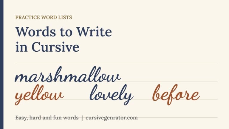
Write each word slowly, ten times, and check that the b and l loops reach the same height and the t stays shorter. For more word lists sorted by what they train, see our page of words to write in cursive.
Common Mistakes
- Making the b exit from the baseline. B exits at the midline. A low exit makes the next letter look disconnected.
- Letting the l loop go round. A wide loop turns l into an e. Keep it tall and narrow.
- Writing an m with two humps. Count to three as you write it.
- Making t as tall as l. A t should stop halfway between the midline and the top line.
- Crossing the t too early. Add the bar after the word is finished, and cross through the stem.
- Mixing letter heights within a word. Draw light guide lines to check the midline, halfway line and top line.
A Short Practice Routine
Draw guide lines on a sheet of ruled paper, including a light halfway line. Then spend a week of short sessions like this.
- Day one and two: Write a full line of lowercase l, then a line of t. Focus on the heights.
- Day three and four: Write a line of b and a line of m. Check the high exit of the b and count the humps of the m.
- Day five: Write the capital versions, one line each, with a small gap before the next letter.
- Day six and seven: Move to words from the lists above, then write one short sentence using all four letters, such as “The little blue bird built a tall tree home.”
Keep each session to ten or fifteen minutes. Handwriting improves through repetition spread across several days, not through one long session.
See B, L, M and T in Cursive First
Writing by hand is the goal, but it often helps to see a letter in context before you try it. Cursive Generator converts anything you type into cursive-style text and previews it across several script fonts, so you can type a word like “mammal” or “bubble” and look at how the b, l, m and t connect before writing it on paper. It is a visual reference, not a replacement for practice, and it works well alongside the guide above.
Frequently Asked Questions
How do you write a cursive b?
Start at the baseline, swing up into a tall loop to the top line, come straight down to the baseline, then curve up and right into a small bowl and finish with a short horizontal exit at the midline. The high exit is what distinguishes b from l.
How do you write a lowercase cursive l?
Start at the baseline, swing up to the top line in a smooth curve, loop over the top and come back down the same slant to the baseline, then add a small upward exit. Keep the loop tall and narrow.
How do you write a cursive m?
Make a short upstroke to the midline, then three humps in a row, each coming down to the baseline and retracing up. Finish with an upward exit. Keep the humps the same height and width.
How do you write a cursive t?
Make a short upstroke that rises halfway between the midline and the top line, come back down to the baseline and add a small exit. Cross the t after the word is finished, through the middle of the stem.
Why does my cursive b look like an l?
Usually because the bowl at the bottom is too small or missing. After coming down the stem, curve up and to the right into a round bowl, and finish with a high exit.
Why does my cursive m look like an n?
Because one of the humps is missing or too small. Count three humps as you write, and give the letter more width than an n.
Should I cross the t before or after writing the word?
After. Finish the whole word first, then add the crossbar. This keeps the pen on the page while you write, which keeps the writing connected and quick.
Is a capital T in cursive the same as lowercase?
No. The capital T is a taller letter with a curved top and a long stem, and in many models the crossbar is a separate stroke. The lowercase t is short, with its crossbar added through the stem after the word.
Conclusion
B, L, M and T look very different, but they come down to heights and counting: tall loops for b and l, three humps for m, and a controlled halfway height for t. Give the b a bowl and a high exit, keep the l loop narrow, count the humps of the m, and cross the t after the word is done. A week of ten-minute sessions is enough to make all four feel natural. To preview how any word looks across real script fonts before writing it by hand, try Cursive Generator.

One Comment