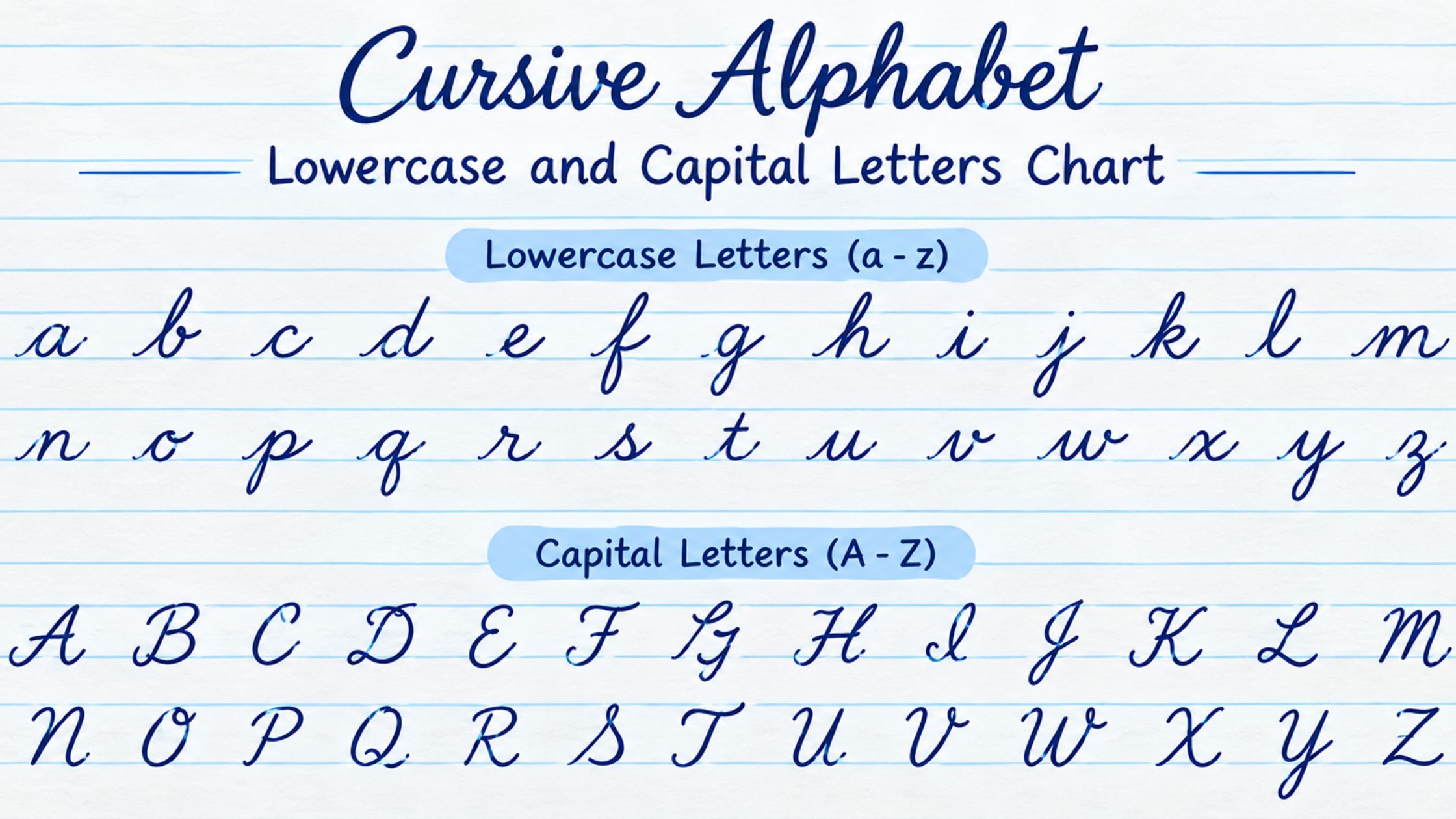
Cursive Alphabet: A-Z Lowercase and Capital Letters Chart
Intro
The cursive alphabet is 52 shapes, not 26: a lowercase and a capital form for every letter, each built to connect to its neighbors in one continuous stroke. Most guides either show a single chart and stop, or bury the useful details inside a full handwriting course.
This guide sits in between. It walks through the whole alphabet in cursive from a to z, groups the lowercase letters into the handful of shape families that make them easier to learn, summarizes how the capitals work, and covers the mistakes that slow most learners down. If you want the complete beginner’s method first, including posture, pen grip and slant, start with the full guide to writing in cursive and come back here for the letter-by-letter reference.
What the Cursive Alphabet Actually Contains
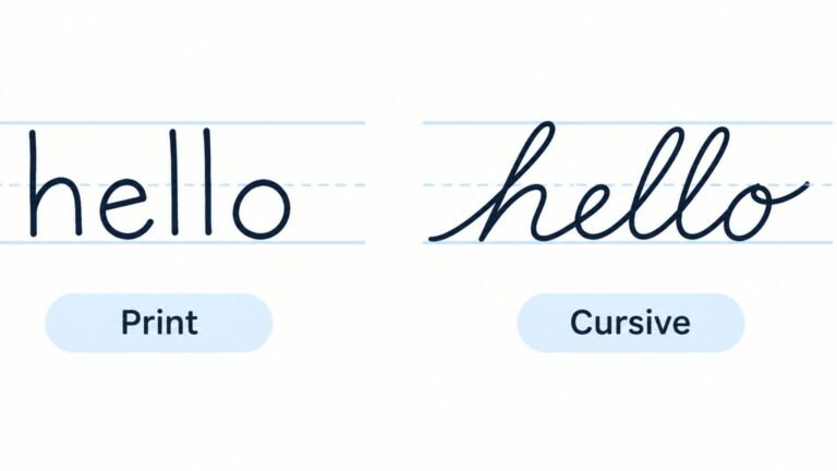
The alphabet in cursive follows the same order as the standard English alphabet, and every letter has two cursive forms. The lowercase set is the one you use for most of what you write, and it is built almost entirely from a few repeating strokes: an oval, a curve that swings up into the next letter, a hump, and a loop. The capital set is a separate group of shapes, taller and more decorative, used to open sentences and names.
That split matters because the two sets behave differently. Lowercase letters are designed to join. Each one ends with a small exit stroke that carries the pen into the next letter, which is what makes a word read as a single flowing line. Capitals are usually finished on their own and sit slightly apart from the lowercase letters that follow. Learning the alphabet as two separate systems, rather than one long list of 52 unrelated shapes, makes the whole thing far less overwhelming.
It also helps to know that cursive alphabets are not identical everywhere. Different school systems teach slightly different capital forms and slightly different slants, so a chart from one source can look a little unlike a chart from another. The overall logic stays the same, which is why this guide focuses on the shape families and strokes rather than on one exact model.
A Short History of the Cursive Alphabet
The modern cursive alphabet descends from the penmanship systems of the 1800s, when clerks, teachers and merchants needed handwriting that was fast, legible and consistent. Spencerian script, developed in the mid-1800s, set out a detailed system of oval and curved strokes meant to be produced with a flowing motion of the whole arm rather than small movements of the fingers.
The Palmer Method, which spread through American classrooms in the early 1900s, simplified that style. It kept the connected strokes and the emphasis on rhythm, but dropped much of the ornamental shading and flourish, so that ordinary students could write it quickly. Most cursive alphabets taught today are further simplified descendants of that tradition, which is why the same oval, curve, hump and loop show up in nearly every version.
Knowing this explains why the alphabet is organized the way it is. The letters were designed around a small set of strokes that the hand repeats, not drawn as 26 independent pictures. That design is what makes it learnable in groups.
The Lowercase Alphabet in Five Shape Families
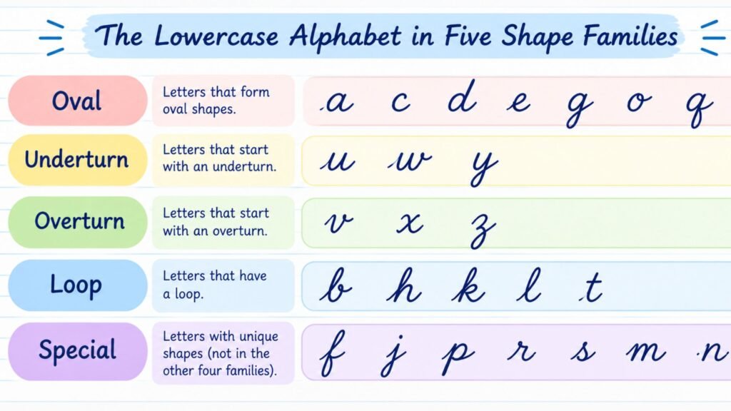
Learning the lowercase letters in alphabetical order is the slowest way to do it. Grouping them by the stroke they share lets one practiced motion unlock several letters at once. Teaching systems group them a little differently, but these five families cover the whole set.
- Oval letters: a, c, d, g, o, q. Each starts with the same counterclockwise oval. Once that oval is steady, the only difference between the six letters is what happens after it closes.
- Underturn letters: i, t, u, w, e. These begin with a small upward curve from the baseline. They are the simplest letters to connect, since the exit stroke flows straight into the next letter’s entry.
- Overturn letters: n, m, v, x, y, z. These are built on a hump or arch rather than a bowl. The rounded top is the part that most often goes wrong, drifting toward a point or collapsing into a flat line.
- Loop letters: b, f, h, k, l, and the descender letters j and p. These rise to a tall loop above the line, or drop to a loop below it. Loop height and loop width are what separate clean ones from messy ones.
- Special letters: r and s. Both are small and compact, with shapes that do not follow the other families, so they are worth practicing on their own.
The Lowercase Alphabet, Letter by Letter
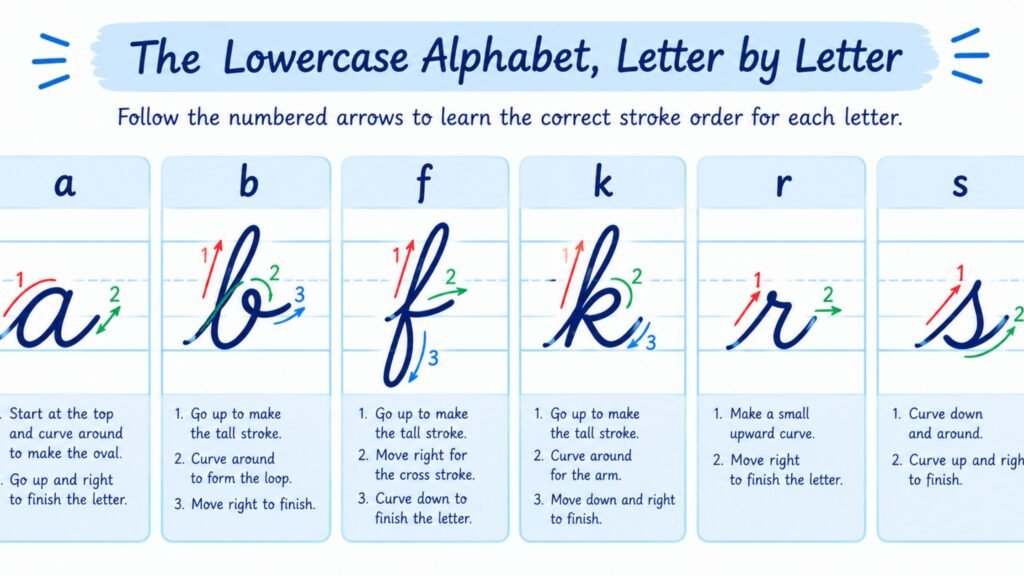
Below is a short description of how each lowercase letter is formed. These are written for a standard slanted cursive model, and they describe the stroke path rather than showing a picture, so keep a printed cursive alphabet chart open beside them. Any standard chart of the alphabet cursive teachers use will work, as long as you compare the slant to the model you are following.
- a: Start at the middle of the letter, travel counterclockwise to close an oval, then draw a short straight stroke back down the right side and out into the exit curve. For a full walkthrough of a, g, k and n, see how to write G, K, A and N in cursive.
- b: Rise from the baseline into a tall loop, come back down the same line to the baseline, then curve around into a small rounded bowl and out to the next letter. For a full walkthrough of b, l, m and t, see how to write B, L, M and T in cursive.
- c: Draw the oval but leave it open on the right side, finishing with a short exit stroke from the top of the curve.
- d: Form the oval of an a, then continue up into a tall stroke and retrace it back down to the baseline before exiting.
- e: Draw a narrow, slanted loop that closes at the center, with the exit rising out of the top of the loop.
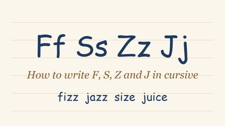
- f: Rise into a tall loop above the line, continue straight down through the baseline into a second loop below it, then cross back up to the baseline. It is the only lowercase letter that extends both above and below the line. For a full walkthrough of f, s, z and j, see how to write F, S, Z and J in cursive.
- g: Form the oval of an a, then drop straight down below the baseline, loop to the left and swing back up to exit.
- h: Rise into a tall loop, retrace down to the baseline, then add a rounded hump on the right ending in an exit stroke. For a full walkthrough of h, e, p and d, see how to write H, E, P and D in cursive.
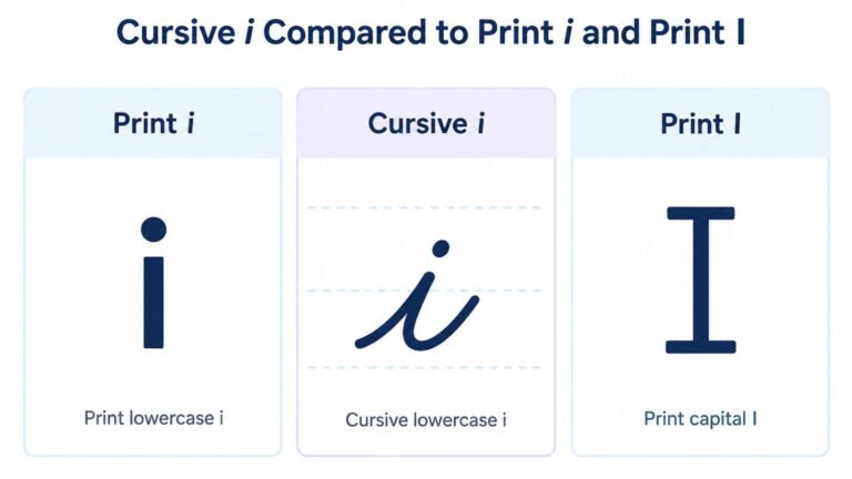
- i: Make a short upstroke from the baseline, come straight back down, and exit. Add the dot after finishing the word, directly above the stem.
- j: Form a short upstroke like an i, drop below the baseline into a loop, and swing back up. The dot goes above, added after the word.
- k: Rise into a tall loop and retrace down, then add a small loop on the right with a short tail exiting from the bottom.
- l: A single tall loop: rise above the middle line, come back down along the same path, and exit at the baseline.
- m: Three connected humps. Keep the humps the same height and the same width, since uneven humps are the most common flaw.
- n: Two connected humps, built exactly like the first two of an m.
- o: Close an oval and finish with a small connecting stroke that leaves from the top, ready to join the next letter.
- p: Make a short upstroke, drop straight down below the baseline, retrace back up, then draw a rounded bowl on the right and exit.
- q: Form the oval of an a, then drop straight down below the baseline and finish with a small tail to the right.
- r: Make a short upstroke, form a small rounded shoulder at the top, and exit down toward the baseline.
- s: Make a short upstroke, form a small peak at the top, curve down along the right side, and finish with a small tail.
- t: Rise slightly above the middle line, come straight down, exit, and add the crossbar after finishing the word.
- u: Two short upstrokes joined at the bottom by a rounded curve, with a small tail finishing out to the right.
- v: Make a short upstroke, form a small rounded top, and finish with a small hook that points out to the right.
- w: Built like a u with a third stroke, ending in the same small hook as a v.
- x: Two crossing strokes: a curved stroke from top left to bottom right, then a separate crossing stroke added after the word is complete.
- y: Make a u shape, then continue the right stroke straight down below the baseline into a loop and swing back up.
- z: Make a short upstroke, a small top, then a descending stroke that loops below the baseline and returns up to the line.
The Capital Alphabet: a Quick Overview
The capital letters are where the cursive alphabet departs most from print. Several capitals, including I, J, Q, T and F, look almost nothing like their block-letter equivalents, and a few pairs resemble each other closely enough to be confused.
Capitals are better learned individually than in families, since each one has its own shape and its own point where learners tend to go wrong. For the full stroke-by-stroke breakdown of all 26, including the pairs that get confused most often, see the dedicated guide to capital cursive letters. Two of the trickiest also have guides of their own, covering the capital R and the capital I in depth.
How Letters Connect Inside the Alphabet
Knowing each shape is only half of the alphabet. The other half is how the letters join. A few principles apply across the whole lowercase set.
Most lowercase letters exit at or near the baseline, and the next letter picks up from there. Letters that begin with an upstroke, like b, h, k and l, need the exit stroke to rise a little higher than usual so that the joint does not look cramped. Letters ending in a curve toward the right, like v and w, connect at a higher point, so the next letter has to start from the top of the stroke rather than the baseline.
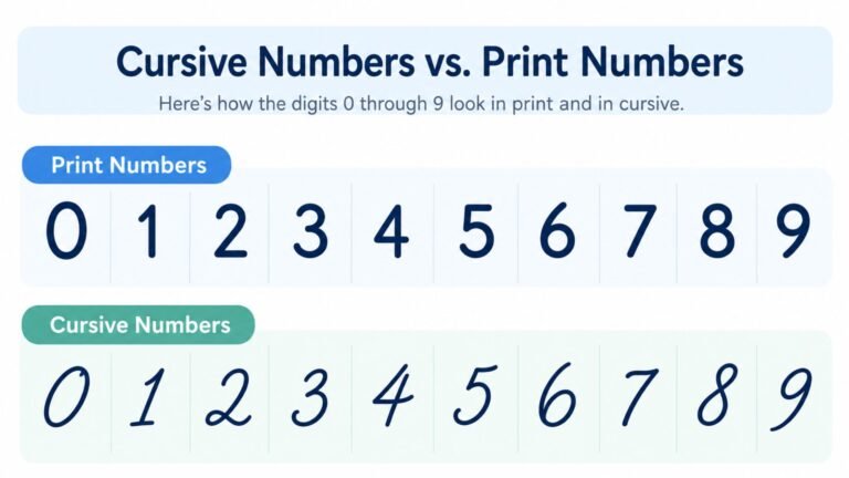
Because connections are so central to the alphabet, they have a dedicated guide of their own. The full explanation, including double letters and the words that cause the most trouble, is covered in the guide to cursive words and connecting letters. Numbers sit outside the alphabet and do not connect to letters at all, which the guide to cursive numbers explains.
Common Mistakes When Learning the Cursive Alphabet
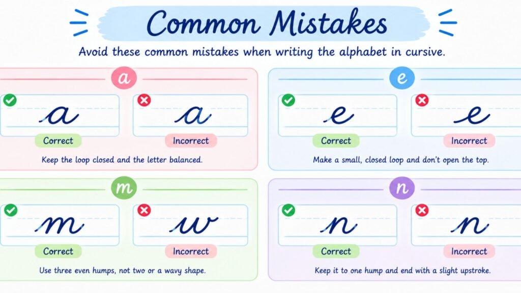
Most alphabet problems come from a short list of habits.
Inconsistent slant is the most common. Letters that lean at different angles within one word look uneven even when each shape is correct. Draw a few light slanted guide lines on practice paper and check against them.
Closed loops that should be open, and open ovals that should be closed, change the identity of a letter. An a that does not close can read as a u, and an e whose loop fills in can read as an i.
Uneven heights make a word look unbalanced. Tall letters like b, h, k and l should all rise to the same height, and descenders on g, j, p, q, y and z should all drop to the same depth.
Writing the alphabet only in order, a through z, trains the hand to produce each letter in isolation. Real writing is words, so practicing joined pairs and short words is what carries over to everyday handwriting.
Skipping the dots and crossbars until the end of the word is a habit worth building early. Adding the dot on an i or the bar on a t after finishing the word keeps the stroke continuous.
Tips for Learning the Cursive Alphabet
A good practice order saves a lot of time.
- Learn one shape family at a time. Spend a session on the oval letters before moving on, so that the shared motion becomes automatic.
- Practice the basic strokes first, before letters. Rows of ovals, upcurves, humps and loops build the muscle memory that every letter draws on.
- Move from single letters to two-letter pairs and then short words. This is where connections start to feel natural.
- Keep sessions short and regular. Ten focused minutes a day tends to work better than one long weekend session, since handwriting is a motor skill that improves with frequent repetition.
- Use ruled paper with a midline. A dotted midline makes it much easier to keep the small letters the same height.
See Your Own Text in Cursive First
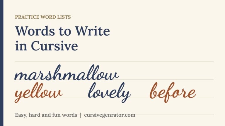
A chart of the alphabet in cursive shows each letter on its own, and the cursive letters alphabet on a worksheet never shows how they sit together. Seeing a real word or name rendered in a cursive script shows how the letters actually sit together.
Cursive Generator converts anything you type into genuine cursive-style text and previews it across several real script fonts at once, so you can see exactly how your own name or a favorite word looks before writing it by hand.
Frequently Asked Questions
How many letters are in the alphabet in cursive?
There are 26 letters in the alphabet in cursive, the same as the standard English alphabet, but each one has two forms, a lowercase and a capital, for 52 distinct shapes in total.
What is the easiest way to learn the cursive alphabet?
Learn the lowercase letters in shape families rather than in alphabetical order. The oval letters a, c, d, g, o and q share one starting motion, and practicing them together is faster than learning each one separately.
Which cursive letters are the hardest?
Most learners struggle most with the capitals, especially I, J, Q, T, F and R, since they differ so much from print. Among lowercase letters, f, k, r and s are usually the trickiest, because their shapes do not follow the same patterns as the others.
Does the cursive alphabet look the same everywhere?
Not exactly. Different teaching systems use slightly different capital forms and slightly different slants. The lowercase set is much more consistent, while capitals vary the most from one model to the next.
Do you lift the pen between letters in cursive?
Within a word, the goal is to keep the pen on the paper, so that each letter flows into the next. The exceptions are the dots on i and j, the crossbars on t and f, and the second stroke of x, all of which are added after the word is finished.
How long does it take to learn the cursive alphabet?
It depends on the learner and how often they practice, but many people can form all the lowercase letters recognizably within a few weeks of short daily practice. Smooth, fast connections take longer, since they depend on repetition rather than memorizing shapes.
Is the cursive alphabet still taught in schools?
Practice varies by region and school. Some systems still teach it as part of the standard curriculum, while others have reduced or dropped it. That is part of why many adults and children now learn it from guides like this one instead.
What is the difference between the cursive alphabet and a cursive font?
The cursive alphabet is the set of handwritten letterforms you learn to write by hand. A cursive font is a typeface designed to imitate those letterforms on a screen. The font is a fixed digital design, while handwriting varies slightly every time.
Conclusion
The cursive alphabet is easier than it first looks once you stop treating it as 52 separate shapes. The lowercase letters fall into five families built from a few repeated strokes, the capitals are a separate system best learned one at a time, and the connections between letters are what make the result read as cursive rather than as decorated print. Learn a family at a time, practice the basic strokes before the letters and the letters before the words, and check slant and height as you go. To see how your own name or a favorite word looks in cursive before you write it by hand, try Cursive Generator and preview it across several real script fonts.

7 Comments