
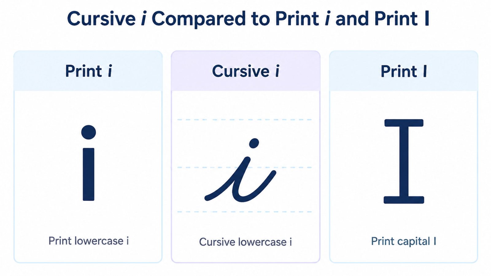
How to Write Cursive I: Uppercase & Lowercase Guide
Cursive I causes a specific kind of confusion that no other letter quite matches. The lowercase form is one of the simplest strokes in the whole alphabet, yet the capital form is one of the most unrecognizable, since a well formed cursive capital I barely looks like the letter I at all and gets mistaken for a J, a number or a stray flourish. This guide covers the exact strokes for both lowercase i and capital I, the single detail that ruins more lowercase i’s than any other mistake, the specific reason capital I trips people up and a quick way to preview your own name in cursive i using real script fonts.
New to cursive? Start with the complete beginner’s guide before diving into this one letter.
A Short History of the Capital Loop
Capital I did not always look this unfamiliar. Early English roundhand and the later Copperplate hand, both developed for engraving and formal correspondence, gave nearly every capital letter an ornamental loop as a matter of course. I was no exception. The loop was not decoration for its own sake. It let a writer keep the pen moving without lifting it, which was the entire point of a connected script built for speed and volume rather than for looking like printed type.
When American schools standardized handwriting instruction in the late 1800s, the Spencerian method kept that large ornamental loop, while the Palmer Method that followed in the early 1900s tightened it into something smaller and faster to produce. Neither system tried to make capital I look more like its print counterpart, because legibility in cursive comes from consistency and flow rather than from resembling a typeface. That is also why the letter has drifted the furthest of any capital in modern casual scripts, which often shrink the loop down to almost nothing. There was never a print-shaped version to drift back toward in the first place.
Why Cursive I Splits Into Two Completely Different Problems
Most letters get harder as they get bigger. Cursive I does the opposite. Lowercase i is short, simple and close to its print counterpart. Capital I is one of the biggest departures from print in the entire cursive alphabet, alongside capital Q and capital Z.
The lowercase form keeps its identity because there just is not much room to change it. A short upstroke, a small peak or curve, a dot placed afterward, that is the whole letter. The capital form has no such constraint. Older handwriting systems gave capital I a long, looping, almost ornamental shape that shares nothing visually with the block-letter I most people picture. That gap between “simple lowercase” and “unrecognizable capital” is exactly why so many searches split cleanly into two separate questions rather than one.
How to Write Lowercase Cursive i
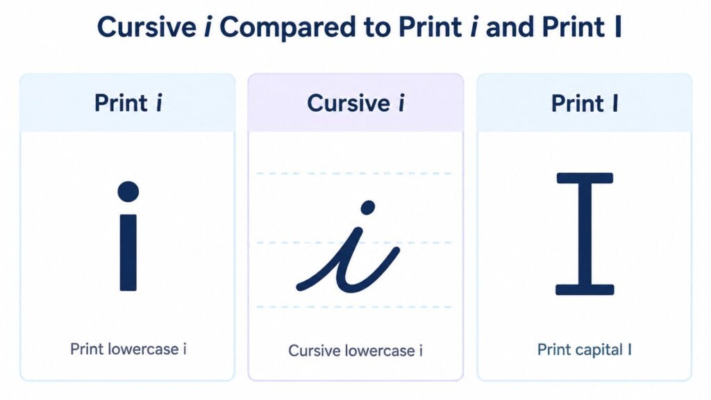
Lowercase cursive i looks close to print at first glance. Two small details separate a correct one from a sloppy one. Neither of them is the shape of the stroke itself.
- Start on the baseline and pull a short, straight upstroke to the midline, the same entry motion used for cursive u and cursive w.
- Curve the top of the stroke into a small peak or a gentle rounded top, staying at or just below the midline rather than reaching up toward the ascender line.
- Bring the stroke back down to the baseline and exit to the right so it connects cleanly into the next letter.
- Add the dot last, after the rest of the word is written, positioned directly above the stroke roughly halfway between the midline and the ascender line.
That dot is where almost every mistake happens. A dot placed too far to the right drifts toward the next letter and starts to read as a cursive j. A dot placed too high looks disconnected from the letter entirely. Going back over a finished word to add every dot at once, rather than dotting each i as you write it, is a common habit. It is also one of the fastest ways to end up with dots that do not line up with their letters once the writing speeds up.
How to Write Uppercase Cursive I (Capital I)
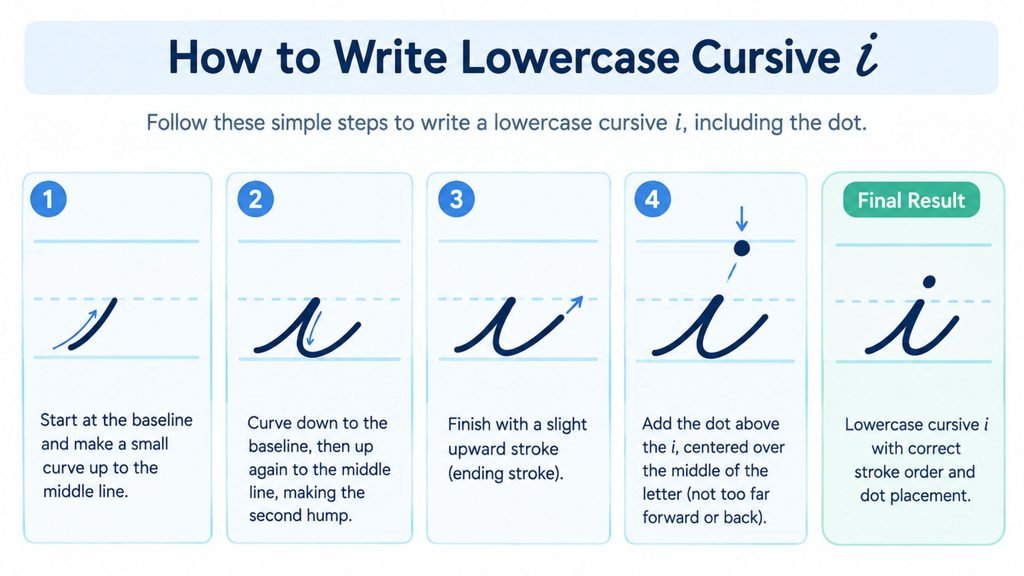
Capital I is the letter most likely to make someone stop mid-sentence and second guess whether they are writing it correctly. There is a good reason for that.
- Start below the baseline with a small loop, then sweep the stroke upward and to the right until it reaches the ascender line, curling into a loop at the top rather than stopping in a straight line.
- From that top loop, bring the stroke back down in a smooth curve that passes close to where it started, forming the tall, narrow body of the letter.
- Continue the downstroke to the baseline, finishing with a small flourish or a short flat stroke depending on the script style being used.
- If the letter connects into the next one, exit to the right at the baseline. If it stands alone, such as when writing “I” as a single word, lift the pen once the downstroke is complete.
The finished shape looks closer to a tall, narrow loop than to a straight vertical line, which is exactly why it gets mistaken for other letters. A capital I with too small a top loop starts to look like a capital J missing its curve. A capital I written too quickly, with the top loop flattened out, can collapse into something closer to an undotted lowercase l stretched tall.
Cursive I Versus Cursive J: The Most Common Capital Mix-Up
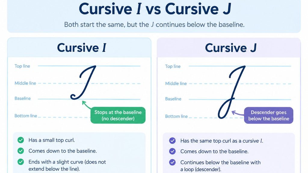
Capital I and capital J share the same basic skeleton, a looped top and a curved downstroke, which is exactly why they get confused so often.
The real difference sits at the baseline, not the top. Capital I finishes its downstroke at or just below the baseline and stops there, sometimes with a small closing flourish. Capital J continues past the baseline into a curved tail that swings back to the left, the same descender shape used in cursive g and cursive y. Someone who rushes the bottom of a capital I and lets the stroke curve left out of habit ends up with something that reads as a J, even if the top of the letter was written correctly.
Three ways to keep them separate:
- Stop the downstroke cleanly at the baseline for capital I. Any curve below that line belongs to J, not I.
- Compare the two letters directly. Writing “Ivy” and “Joy” side by side and checking that the I stays entirely above the baseline while the J drops below it is a fast way to catch the habit.
- Watch your speed on the last stroke. The mix-up usually happens on the final flick of the pen, not on the opening loop, so slowing down at the very end of the letter fixes it faster than slowing down the whole stroke.
Connecting I to Other Letters
Lowercase i connects easily since its exit stroke sits right at the baseline heading into whatever comes next. Before a letter that starts low, such as a, c or e, the connection is a straight, short line. Before a letter that starts with its own upstroke, such as l, b or t, the two upstrokes flow into each other almost without a break.
Capital I is different because it rarely connects into a following letter at all. Most cursive styles treat a capital letter at the start of a word as a stand-alone stroke, with a small gap before the lowercase letters that follow, rather than forcing an unbroken line from I straight into the rest of the word. Trying to force a hard connection here usually makes the capital’s top loop collapse, which is one more way a rushed capital I ends up looking like something else entirely.
The dot on lowercase i deserves its own note here. In a word with more than one i, such as “skiing,” each dot needs to land above its own stroke rather than being placed as a group after the whole word, since a cluster of dots floating over the wrong letters is harder to read than a missing dot would be.
See Your Name Written in Cursive I
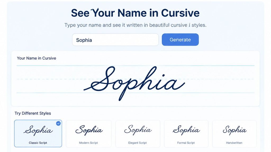
A written description of a loop and a downstroke only goes so far. Seeing capital and lowercase cursive i rendered in an actual script typeface shows the proportions in a way a diagram cannot, especially the size of that top loop on the capital form.
Cursive Generator turns typed text into genuine cursive characters. Its preview section shows the same word rendered across several real script fonts at once. Typing a name that starts with I or one that contains a lowercase i is a quick way to see exactly how much the capital loop and the lowercase dot placement shift between a tighter, more formal script and a looser, more casual one.
Cursive I Across Different Script Styles
| Style | Lowercase i shape | Capital I shape |
| Spencerian | Narrow peak, dot set high and precise | Large ornamental loop with a pronounced flourish at the base |
| Palmer Method | Simple rounded top, compact dot | Smaller, tighter loop with a short, plain downstroke |
| Modern casual script | Minimal peak, sometimes nearly a straight line | Reduced loop, occasionally simplified into a single curved stroke |
| Copperplate calligraphy | Sharp peak with thick and thin line contrast | Elaborate looped top with heavy shading on the downstroke |
The capital form changes far more than the lowercase form across these styles, which lines up with how much more room the letter has to vary once it stops resembling the print version at all.
Why the Dot Matters More Than the Stroke
Most handwriting instruction spends its time on the body of a letter and treats a dot or crossbar as an afterthought. Lowercase cursive i flips that. The stroke itself is nearly identical to a lowercase l without the height or a lowercase u without the second hump, so the dot is doing almost all of the work of identifying the letter.
This is also why dotting as you go, rather than sweeping back over a finished word to add every dot at once, matters more for legibility than the shape of the stroke underneath it. A perfectly formed i with a misplaced or missing dot reads as a different letter. A slightly uneven i with a correctly placed dot still reads clearly as an i.
Handwritten Practice Versus Typed Previews
The two forms of this letter benefit from two different kinds of reference, which makes combining handwritten practice with a typed preview especially useful here.
Handwritten repetition is what actually trains the hand to place a dot consistently and to stop a capital’s downstroke at the baseline without thinking about it. Neither habit forms from reading about it once. A short daily practice line, alternating between a few lowercase i’s and a few capital I’s, builds both habits faster than long, infrequent sessions.
A typed preview solves a different problem: it shows the correct proportions before a single stroke is committed to paper, especially the size of that capital loop relative to the rest of the letter, which is genuinely hard to judge from a text description alone. Comparing a typed reference against your own handwritten attempt, letter by letter, catches proportion problems that are easy to miss when checking your own writing in isolation.
Tips for Practicing Cursive I
The two forms of this letter need almost opposite practice approaches, since one is about precision and the other is about proportion.
- Practice the lowercase dot separately from the stroke. Write a full line of undotted i strokes first, then go back and add dots in a second pass, checking that each one sits directly above its stroke.
- Slow down on the capital’s top loop. A rushed capital I is the single fastest way to end up with a letter that reads as a J or a stretched l.
- Compare capital I against capital J side by side regularly. The baseline is the detail that separates them, so checking it explicitly catches the habit before it becomes automatic.
- Write i inside real words, not only in isolation. The dot placement habit that causes the most trouble, dotting an entire word after the fact, only shows up once you are writing full sentences rather than single letters.
- Trace a few rows of the capital form before attempting it freehand. The top loop’s proportions are the hardest part of this letter to get right from memory alone.
Frequently Asked Questions
How do you write a lowercase i in cursive?
Pull a short upstroke from the baseline to the midline, curve the top into a small peak, bring the stroke back down to the baseline and exit to the right. Add the dot afterward, positioned directly above the stroke about halfway between the midline and the ascender line.
What does a capital I look like in cursive?
Capital I starts below the baseline, sweeps upward into a loop at the ascender line, then curves back down through the middle of that loop to the baseline, finishing with a small flourish. The result looks like a tall, narrow loop rather than a straight vertical line.
Why does cursive capital I look like a J?
It happens when the downstroke of capital I curves past the baseline instead of stopping cleanly at it, borrowing the descending tail that belongs to capital J. Keeping the bottom of the stroke flat at the baseline is what keeps the two letters visually distinct.
When should you dot a lowercase cursive i?
After finishing the rest of the letter or word, not while writing the upstroke itself. Dotting immediately keeps each dot aligned with its own letter, while going back to dot an entire word afterward is more likely to misplace a dot over the wrong stroke, especially in words with more than one i.
Is capital I written the same way in every cursive style?
No. It varies more than almost any other capital letter. Spencerian script gives it a large, ornamental loop with a pronounced flourish, the Palmer Method tightens that loop and simplifies the downstroke, while modern casual scripts often shrink the loop until the letter barely resembles the traditional form at all.
Conclusion
Cursive I is really two different letters wearing the same name. The lowercase form rewards precision on a small dot far more than it rewards stroke shape, while the capital form rewards a confident top loop and a clean stop at the baseline so it never drifts into a J. Once those two habits are in place, the letter that seemed the most unpredictable in the cursive alphabet becomes one of the more consistent ones to write. To see the finished proportions before committing them to paper, type a name into Cursive Generator and compare capital and lowercase i across several real script fonts in the preview section.
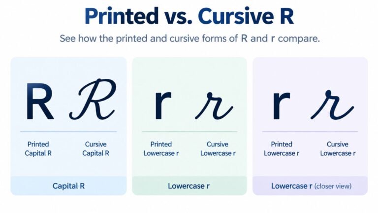
Related letter guide: How to Write Cursive R covers the same style comparison and stroke-by-stroke approach for the letter R, including the mix-up between cursive r and cursive n.
3 Comments