
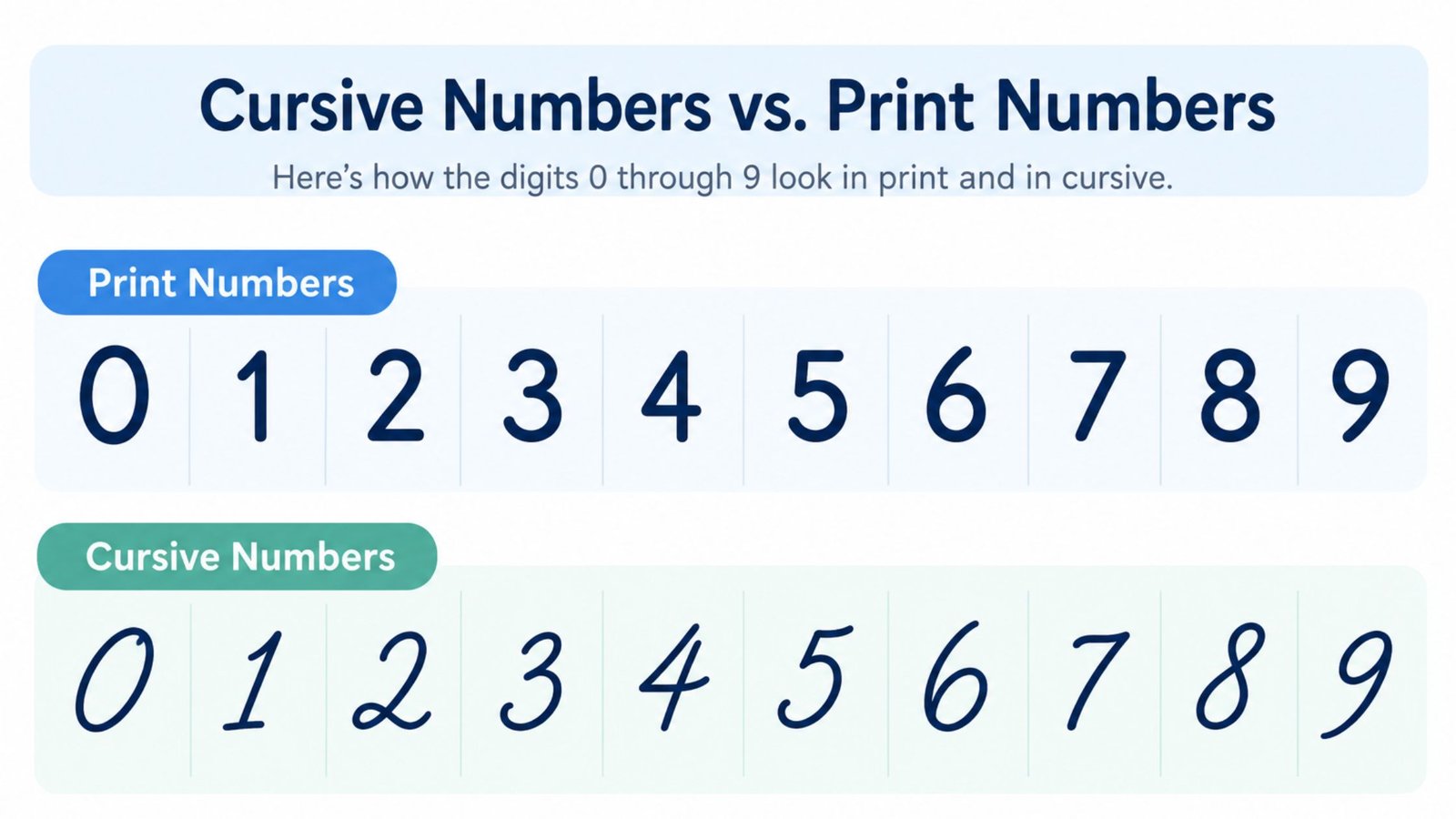
How to Write Numbers in Cursive: A Complete Guide
New to cursive? Start with the complete beginner’s guide to writing in cursive before working through the digits below.
Cursive numbers work differently from cursive letters. That single fact answers most of the confusion people run into when they start searching for how to write them. Numbers do not connect to each other or to the letters around them the way cursive letters do. What actually changes is the slant, proportion and flow of each digit so it matches the cursive writing surrounding it. This guide covers what actually makes a number look cursive, how to write each digit from 0 through 9, the specific pairs that get confused most often and how numbers sit inside cursive words and sentences.
Are There Really Cursive Numbers?
This is worth answering directly, since it trips up more people than any other part of the topic. In traditional cursive handwriting systems, including Palmer and Spencerian script, digits are not joined together the way letters inside a word are. A cursive “23” is not one continuous pen stroke the same way a cursive “to” is. Each digit is still written as its own separate figure.
What makes a number look cursive instead of printed is the style of that individual figure, not a connection to its neighbor. A cursive-style 3 leans with the same slant as the surrounding letters, has softer, rounder curves than a print 3 and sits on the baseline the same way a lowercase letter does. Line up ten digits in a row and they look like they belong in a cursive document, even though no stroke actually links one to the next.
This distinction matters because it changes what you are actually practicing. You are not learning to connect a 1 to a 2. You are learning to make each individual digit slant, curve and sit consistently so the whole number blends into cursive text around it.
A Short History of Cursive Numerals
The joined-up alphabet most people picture when they hear the word cursive grew out of centuries of copybook handwriting, from Renaissance chancery hands through the Spencerian script of the 1800s and later the Palmer Method that dominated American classrooms for much of the twentieth century. Numerals followed a different path. Arabic numerals reached Europe through medieval trade and scholarship centuries before any of those cursive alphabets existed. By the time handwriting manuals started teaching joined letters, digit shapes were already standardized for arithmetic and record keeping.
That earlier standardization is part of why numerals never picked up connecting strokes. A merchant’s ledger or a bank draft needed every digit to be read correctly on its own, without the ambiguity a joined stroke could introduce between one figure and the next. Copybook authors leaned into that need rather than against it. Spencerian and Palmer Method instruction manuals both taught numerals as individually slanted, rounded figures styled to match the surrounding cursive text, while keeping each digit fully separate from its neighbors.
That same split carried into how handwriting gets taught today. A cursive alphabet chart shows connecting strokes between letters. A numerals chart, even one styled for cursive practice, shows ten separate figures. The history explains the pattern this guide walks through step by step, styled digits that clearly belong with cursive writing, formed one at a time rather than joined together.
General Rules for Cursive-Style Numbers
A few rules apply across all ten digits. Getting these consistent matters more than any single digit’s exact shape.
- Match your slant. Whatever angle you are using for your cursive letters, use the same angle for every digit. A number written upright in the middle of a slanted cursive sentence looks out of place immediately, even if the digit itself is formed correctly.
- Keep proportions even. Most digits should occupy the same vertical space as a lowercase cursive letter, roughly between the baseline and the midline, with only 1 and sometimes 7 extending taller depending on the exact style. A number that towers over the surrounding letters or shrinks below them breaks the visual rhythm of the line.
- Round the corners. Print numbers tend to have flatter, more angular strokes. Cursive-style numbers soften those into curves, which is most noticeable on digits like 2, 3 and 5.
- Stay on the baseline. Every digit should sit on the same baseline as the lowercase letters around it, with descenders (mainly on a stylized 9 or 7 in some scripts) dropping below it the same way a cursive g or y would.
How to Write Each Number in Cursive
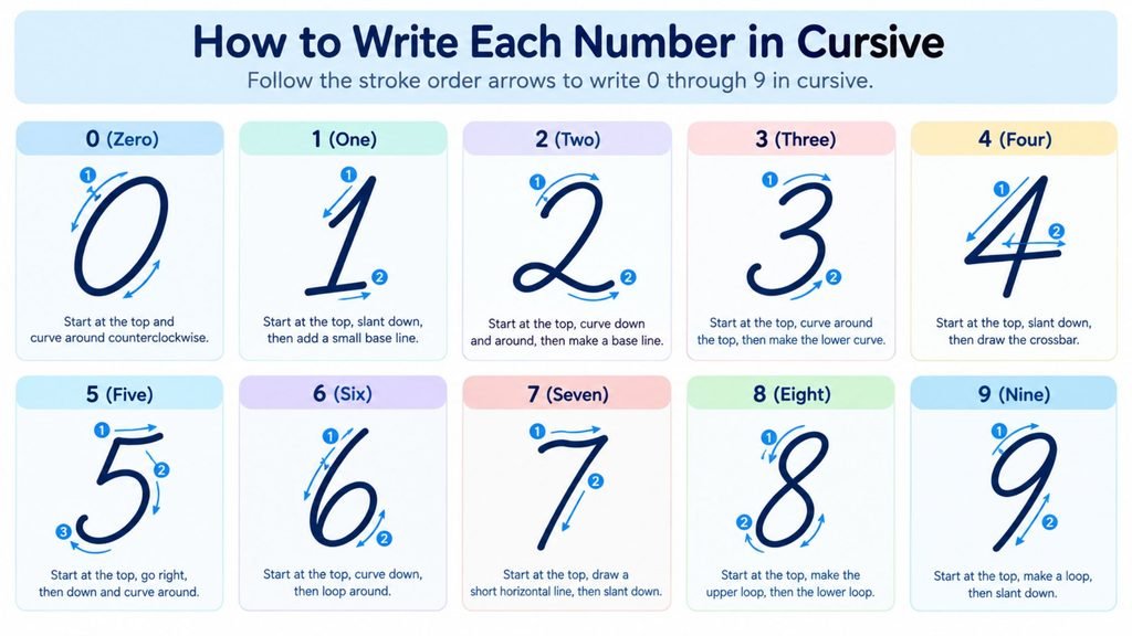
Each digit keeps its basic print identity but picks up the slant and rounded curves described above.
- 0: A closed, slightly slanted oval rather than a perfectly round circle. Keep the top and bottom curves symmetrical so it does not lean into looking like a 6 or an 8.
- 1: A single slanted downstroke, often starting with a small flag or entry stroke at the top rather than the flat serif a print 1 sometimes has.
- 2: A rounded top curve that swings down into a flatter base stroke, softened at the bottom rather than the sharp corner a print 2 has.
- 3: Two stacked curves leaning the same direction, with the top curve slightly smaller than the bottom one and no flat middle point the way a print 3 sometimes has.
- 4: Either an open or closed top, depending on style, with a straight or slightly curved vertical stroke through the middle. Cursive versions usually round the top corner more than print versions do.
- 5: A short top stroke, a curved body and a flat or rounded base. The top stroke tends to curve into the body rather than meeting it at a sharp angle.
- 6: A curved stroke that loops back into a closed lower bowl. The loop should stay tight so it does not drift toward looking like an 8.
- 7: A straight top stroke and a slanted downstroke, sometimes with a small horizontal tick through the middle in certain styles, though many cursive fonts drop that tick entirely.
- 8: Two stacked loops of roughly equal size, formed in one continuous curve rather than two separate circles stacked on top of each other.
- 9: A closed upper loop with a slanted downstroke that sometimes extends below the baseline as a small descender, depending on the script style.
Common Mistakes When Writing Cursive Numbers
Most cursive number problems trace back to a small set of habits. Spotting them in your own writing is usually enough to fix them.
Writing numbers upright while the surrounding letters slant is the single most common mistake, since it is easy to focus so hard on a digit’s shape that the slant gets dropped entirely. The fix is simple: check every number against the letters directly beside it before moving on.
Mixing print and cursive shapes in the same number produces a hybrid digit, part sharp print corner and part cursive curve, that tends to look unfinished rather than stylish. Pick one style per figure and commit to it fully.
Making loops too loose on 6, 8 and 9 invites confusion with a neighboring shape, particularly 0 or 5. Closing the loop fully is a small adjustment that fixes most legibility complaints.
Cramming multi-digit numbers together removes the breathing room that years, phone numbers and addresses need between digits, covered in more detail below. Skipping that spacing is what makes an otherwise well formed number hard to read at a glance.
Ignoring baseline placement lets a digit float above or sink below the baseline the surrounding letters use, which breaks the visual line just as much as a mismatched slant does, even when the digit’s shape itself is correct.
Numbers That Get Confused Most Often
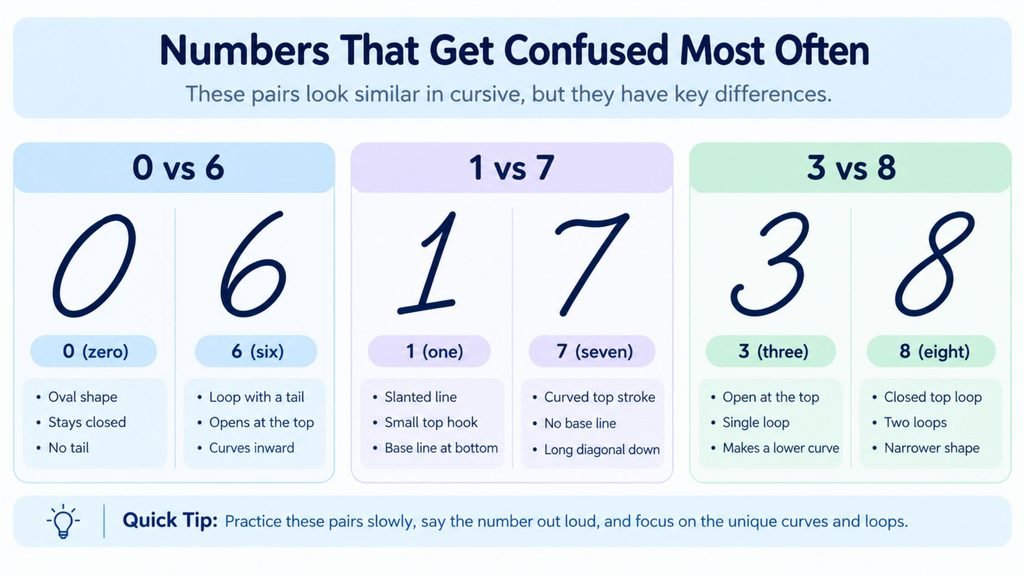
A handful of digit pairs cause the same kind of mix-up that certain cursive letters do. Knowing them ahead of time prevents most of the trouble.
0 and 6 get confused when the loop on a 6 opens up too much at the top, leaving it looking like an oval with a tail rather than a clearly closed loop. Keeping that loop tight and fully closed is what keeps the two digits distinct.
1 and 7 get confused when a cursive 1 picks up too much of an entry flourish, making it look like the top stroke of a 7. Keeping the 1 as a clean, mostly vertical stroke with only a small flag avoids the overlap.
3 and 8 get confused when the two curves of a 3 close up too tightly, starting to resemble the stacked loops of an 8. Leaving a visible gap on the open side of the 3 keeps it readable.
4 and 9 get confused less often. A 4 with an overly rounded top can start to resemble the upper loop of a 9, especially when written quickly. Keeping the top of a 4 more angular than the loop of a 9, even in a cursive style, preserves the distinction.
Writing Numbers Inside Cursive Sentences
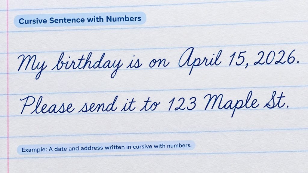
Numbers show up constantly inside otherwise cursive writing, whether it is a date, an address, an age or a quantity. They need to sit naturally alongside the letters rather than looking like they were dropped in from a different style.
Spacing matters more with numbers than with letters, since there is no connecting stroke to guide the eye from one digit to the next. Leave slightly more visual breathing room between digits than you would between connected letters, without leaving so much space that the number reads as disconnected from the rest of the line.
Mixed content, like a street name followed by a house number or a sentence that includes an age or a date, reads best when every digit and every letter shares the same slant and sits on the same baseline. That consistency is what makes numbers look like part of the same handwriting rather than an inserted printed element.
Multi-digit numbers, such as a year or a phone number, are written as a sequence of individually formed digits rather than run together as one shape. The rules above, matching slant, keeping proportions even, staying on the baseline, apply to every digit in the sequence the same way they apply to a single number on its own.
See Your Numbers in Cursive Style First
Reading a description of ten different digit shapes is a lot to hold in your head at once. Seeing them rendered cleanly in an actual script typeface makes the proportions and curves far easier to copy by hand.
Cursive Generator converts typed text, including numbers, into genuine cursive-style characters and previews them across several real script fonts at once. Typing a date, an age or a short number sequence is a fast way to see exactly how each digit should slant and curve before practicing it on paper.
Tips for Practicing Cursive Numbers
A short, focused practice routine works better here than long, unstructured sessions, mainly because there are only ten shapes to master rather than a full alphabet.
- Practice the confusing pairs together. Write a row of 0s directly above a row of 6s or a row of 1s above a row of 7s, so any drift toward looking alike becomes obvious immediately rather than staying hidden.
- Write full number sequences, not just single digits. Dates, phone numbers and short counts force you to keep slant and spacing consistent across several digits in a row, which single-digit practice does not test.
- Check your slant against your letters, not just against other numbers. The most common giveaway of an inconsistent cursive number is a slant that does not match the handwriting around it, so comparing a written number directly against a nearby cursive word catches this fast.
- Slow down on 3, 6 and 8. These three digits depend the most on tight, well formed curves. They are the first to lose their shape when writing speeds up.
Frequently Asked Questions
Are there really cursive numbers?
Numbers do not connect to each other the way cursive letters do, so there is no single unbroken stroke linking one digit to the next. What makes a number look cursive is its slant, its rounded curves and how closely it matches the proportions of the cursive letters around it.
How do you write numbers in cursive?
Match the slant of your cursive letters, keep each digit’s proportions close to a lowercase letter’s height, round out the corners that a print version would leave sharp and keep every digit sitting on the same baseline as the surrounding writing.
How do you write cursive numbers so they are easy to read?
Focus on the pairs that commonly get confused, especially 0 and 6, 1 and 7, plus 3 and 8. Keeping loops fully closed and curves clearly separated is what keeps a handwritten number sequence legible at a glance.
Why don’t numbers join together in cursive the way letters do?
Numerals were never designed with connecting strokes the way the cursive alphabet was, since most historical handwriting systems treated digits as individual figures even within otherwise fully joined script. The cursive look comes from styling each digit consistently, not from linking them.
Do all cursive fonts write numbers the same way?
No. The overall shape of each digit stays recognizable. Details like the size of a 1’s entry flourish, whether a 7 gets a crossbar or how far a 9’s tail descends below the baseline vary from one script style to another.
Should children learn cursive numbers at the same time as cursive letters?
Most handwriting curricula introduce numerals early, often before the full cursive alphabet, since there are only ten shapes to master compared to fifty-two upper and lowercase letters. Practicing cursive numbers first can build slant and baseline habits that carry directly into learning the letters afterward.
Can cursive numbers be used in formal or legal documents?
Yes, with a caution. Many forms and legal documents specifically request printed digits to avoid any ambiguity, particularly around figures like 1 and 7 or 0 and 6. For personal letters, journals and everyday handwriting, cursive-style numbers are perfectly appropriate. It is worth checking a form’s instructions before filling in dates or amounts by hand.
Conclusion
Cursive numbers come down to consistency rather than connection. Match your slant, round out the corners a print digit would leave sharp and keep every figure sitting on the same baseline as your letters. Pay extra attention to the pairs that tend to blend together, especially 0 and 6, 1 and 7, plus 3 and 8. Once those habits are in place, numbers stop looking like a printed element dropped into cursive writing and start reading as part of the same handwriting. To see how a date, an age or a short number sequence looks before writing it by hand, try Cursive Generator and preview it across several real script fonts.
4 Comments