
How to Write Capital Cursive Letters: A-Z Guide
New to cursive? Start with the complete beginner’s guide to writing in cursive before working through the capitals below.
Capital cursive letters are where most beginners get stuck. Lowercase letters mostly keep a rough resemblance to their print shape, just softened and connected, but capitals often depart from print entirely, built around ornamental loops carried over from historical handwriting systems rather than shaped to look like block letters. This guide walks through all 26 capital cursive letters, the general rules that apply across the whole alphabet, the specific letters and pairs that trip people up most, and how capitals behave differently from lowercase letters when they connect into words.
Why Capital Cursive Letters Are Harder Than Lowercase
This is worth explaining upfront, since it changes how you should practice. Most lowercase cursive letters can be learned as a group, because the underlying strokes repeat across many of them: a, c, e and o all share a similar rounded entry stroke, for instance. Capital letters do not share that shortcut nearly as often. Each one tends to have its own specific shape, built around its own specific loop, hump or curve, which means each one also has its own specific point where beginners go wrong.
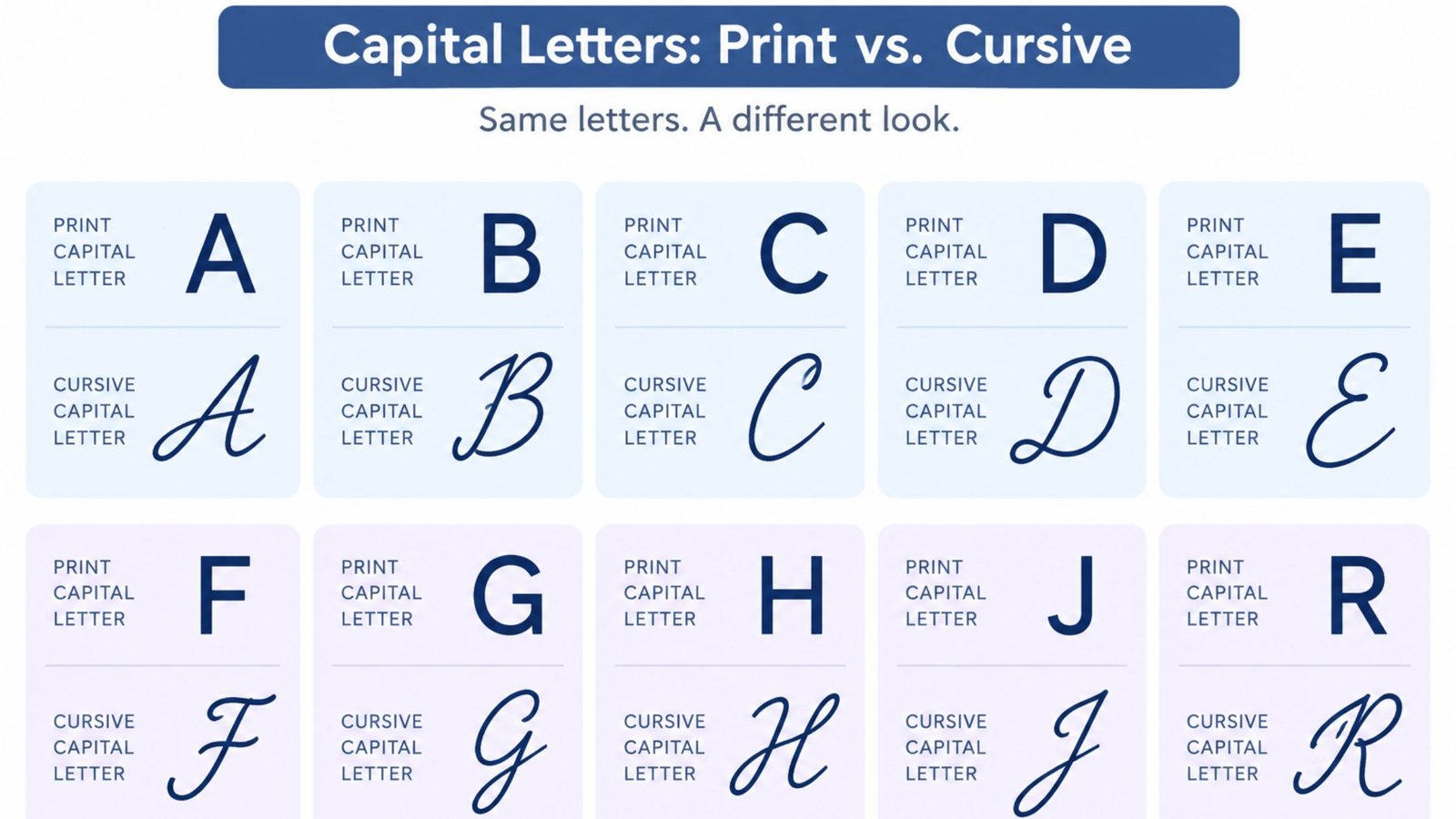
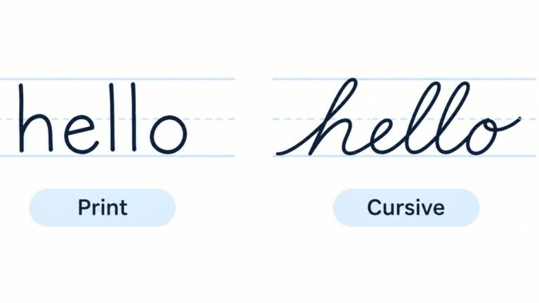
The gap between print and cursive is bigger for capitals too. A print capital A is three straight lines. A cursive capital A opens with a loop. A print capital R is a closed bowl with a diagonal leg. A cursive capital R drops the bowl entirely and becomes a single flowing stroke that barely resembles the print version at all. Multiply that gap across all 26 letters and it is easy to see why capitals, not lowercase letters, are what most people mean when they say cursive is hard to learn.
None of this means capitals are impossible to learn quickly. It means they reward being practiced one at a time rather than in a batch, with extra attention on the handful of letters, covered later in this guide, that get confused with each other or with numerals most often.
A Short History of Capital Cursive Letters
The ornamental quality of cursive capitals is not an accident of individual handwriting; it is inherited directly from the copybook systems that standardized cursive instruction. Spencerian script, developed in the mid-1800s, built its capital letters around sweeping, continuous loops meant to keep the pen moving without lifting, a style suited to fountain pens and the formal correspondence of the era. The Palmer Method, which replaced Spencerian in most American classrooms by the early 1900s, simplified many of those loops but kept the core idea: capital letters are shaped for stroke efficiency and flow, not for resemblance to printed type.
That priority is exactly why letters like capital I, capital R and capital Q look so different from their print counterparts. A continuous flowing stroke was considered good handwriting technique, and a capital letter that required lifting the pen or doubling back sharply worked against that goal. Lowercase letters, used far more often and typically smaller, did not need the same ornamental treatment to stay efficient, which is part of why they stayed closer to print.
Modern cursive instruction, including the handwriting most adults over about 30 learned in school, is a direct descendant of Palmer Method forms. The ornamental capitals that feel unfamiliar today are not a stylistic flourish added for decoration; they are what is left of a system built for speed and continuous pen movement.
General Rules for Writing Capital Cursive Letters
A few rules apply across all 26 capitals. Getting these consistent matters more than perfecting any single letter’s exact shape.
- Start every capital with intention. Unlike most lowercase letters, which connect directly from the letter before them, a capital at the start of a word is usually its own independent stroke. Rushing the entry stroke is one of the most common reasons a capital’s shape collapses partway through.
- Keep capitals taller than lowercase letters, but not by too much. Most cursive capitals occupy roughly the space between the baseline and a line noticeably above the midline used by lowercase letters, but towering height differences between a capital and the lowercase letters that follow it break the visual rhythm of a line just as much as inconsistent slant does.
- Match your slant across every letter, capital or lowercase. A capital written upright in the middle of a slanted line looks out of place immediately, the same problem that affects cursive numbers when they lose their slant.
- Leave a small gap before connecting to the next letter. Most cursive styles treat a capital as its own stroke, with a brief visual gap before the lowercase letters that follow rather than one unbroken line straight from the capital into the rest of the word. Forcing a hard connection here is a common cause of a capital’s shape collapsing.
How to Write Each Capital Letter in Cursive
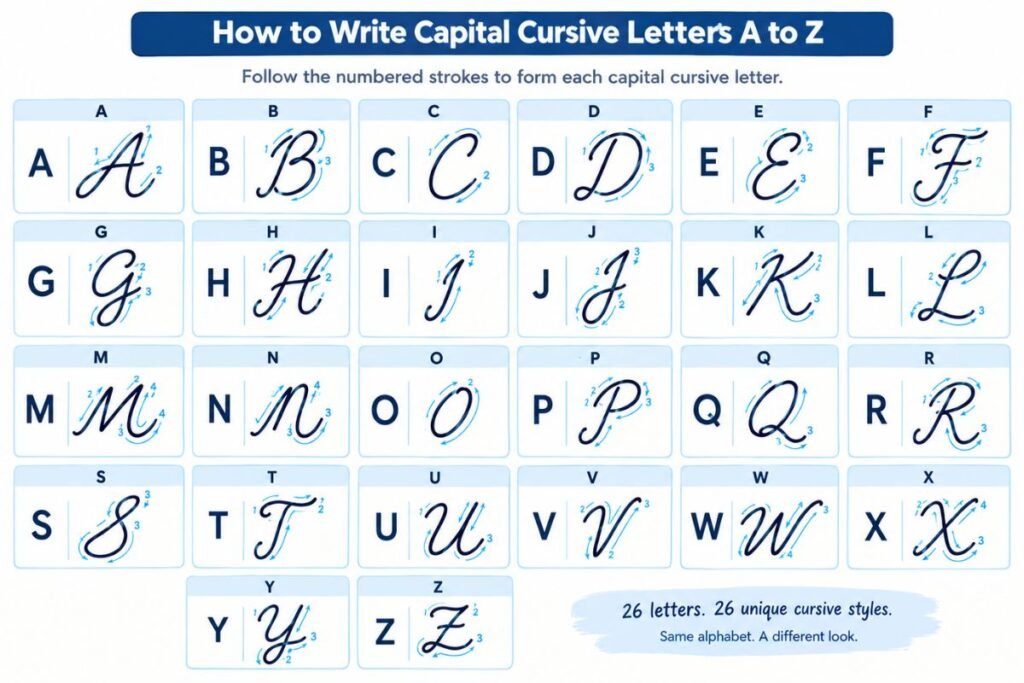
Each capital keeps a loose connection to its print identity, but nearly every one adds a loop, hump or continuous curve that a print version does not have.
- A: Opens with a loop at the upper left that curves down and around into a shape that still resembles a print A, finishing with a small tail stroke that leads into the next letter.
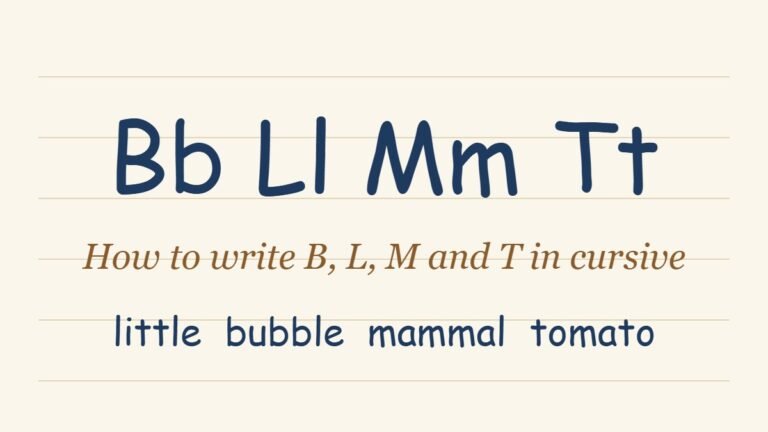
- B: A tall vertical stroke with two rounded bumps stacked on the right side, traced back over itself as one continuous motion instead of the separate strokes print B uses.
- C: A single open curve, close to a backwards-leaning print C, usually starting with a small entry loop at the top.
- D: A tall upper loop that curves down into a rounded bowl at the base, keeping a rough resemblance to print D with an added loop on top.
- E: A small closed loop at the top flowing directly into a curved base stroke, quite different from print E’s three horizontal bars.
- F: A tall stroke topped with a loop and crossed partway down by a curved stroke that loops back into a small tail, trading print F’s flat crossbars for continuous curves.
- G: Built on the same curve as a cursive C, extended with a loop that drops below the baseline, merging print G’s curve with a lower loop.
- H: A tall looped stroke on the left connected by a low bridge to a shorter rounded hump, with little visual resemblance to print H’s two verticals and crossbar.
I: A tall, narrow loop rather than a straight vertical line, one of the most-searched cursive capitals because it departs so far from print. The complete stroke-by-stroke breakdown, including the I-versus-J mix-up, is covered in the dedicated guide to cursive I.
- J: A descending loop below the baseline, essentially capital I’s loop mirrored downward instead of upward, which is exactly why the two get confused when written quickly.
- K: A tall vertical stroke with a looped upper portion and a diagonal leg trailing to the lower right, keeping more resemblance to print K than most other capitals do.
- L: A tall upper loop that curves into a wide base stroke, similar in spirit to a cursive D but without the closed bowl at the bottom.
- M: Three connected humps rising from the baseline, all formed in one continuous stroke instead of the three separate strokes print M is built from.
- N: Two connected humps, essentially a shorter version of M, and the capital most often mistaken for cursive R when the humps round out too much.
- O: A closed, slightly slanted oval with a small loop or crossing point at the top where the stroke overlaps itself.
- P: A tall vertical stroke with a rounded loop at the upper right, traced back down over itself before continuing into the next letter.
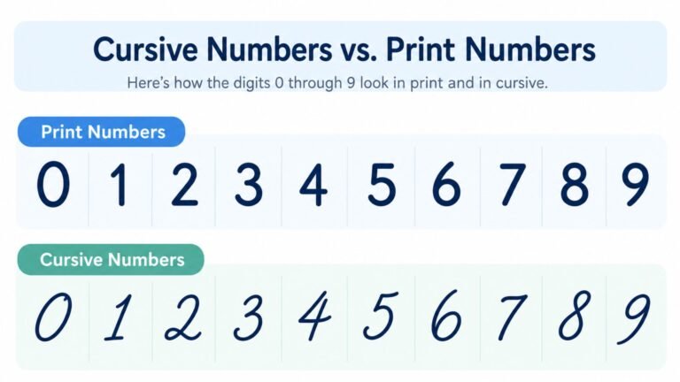
- Q: A closed loop similar to a cursive O, finished with a small hooked tail at the bottom right, close enough in shape to the numeral 2 that the two are mixed up constantly.
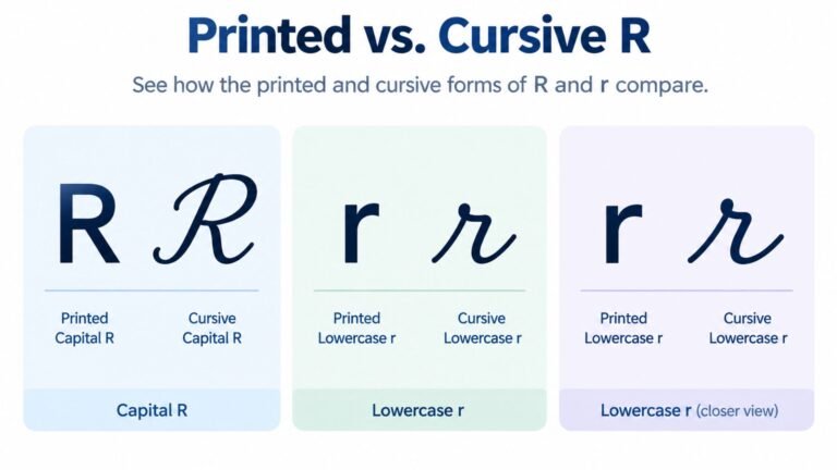
R: A single continuous stroke that drops the closed bowl and separate leg of print R entirely, ending up closer to a cursive P with an added diagonal. The complete breakdown, including the R-versus-N mix-up, is covered in the dedicated guide to cursive R.
- S: A tall, narrow double curve, closer to a stretched print S than most other capitals, though the top loop is often exaggerated in more ornamental styles.
- T: A tall vertical stroke crossed by a looped stroke near the top, in place of print T’s simple flat crossbar.
- U: A rounded dip similar to a tall lowercase u, usually starting with a small entry loop at the upper left.
- V: A rounded dip similar to U but left open on the right side, finishing with a small upward flick instead of a closing stroke.
- W: Two connected dips, essentially a wider version of V, formed as one continuous stroke rather than three separate strokes.
- X: Two crossing diagonal strokes, one of the few capitals that keeps nearly the same shape as its print version, just softened at the corners.
- Y: A descending loop below the baseline similar to J, topped with a small rounded entry curve rather than J’s straighter top stroke.
- Z: A stroke that curves down into a loop below the baseline, trading print Z’s sharp angles for one continuous flowing curve.
Capital Letters That Get Confused Most Often
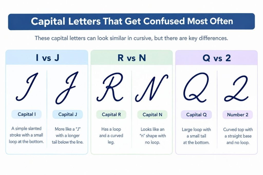
A handful of capital letter pairs, and one letter-numeral pair, account for most of the confusion beginners and even experienced cursive writers run into.
I and J get confused because capital J is essentially capital I’s loop flipped below the baseline instead of above it. Written quickly, the direction of that loop is easy to lose track of, which is why the dedicated cursive I guide covers this mix-up in detail.
R and N get confused because cursive R drops print R’s closed bowl entirely and becomes a single flowing stroke that can round out into something very close to the two connected humps of a cursive N, especially at speed. The dedicated cursive R guide covers this pairing stroke by stroke.
Q and the numeral 2 get confused surprisingly often, since a cursive capital Q closes into a loop finished with a small hooked tail, a shape that overlaps heavily with how a cursive-style 2 is formed. This mix-up shows up most in dates, codes or any text that mixes letters and digits closely together.
T and F get confused in more ornamental cursive styles, where both letters are built from a tall vertical stroke topped with a looped crossbar. Keeping F’s loop slightly lower and more compact than T’s is usually enough to keep the two distinct.
How Capital Letters Connect to the Rest of a Word
Capital letters behave differently from lowercase letters when it comes to connecting into a word, and misunderstanding this is a common source of collapsed or illegible capitals.
Most lowercase letters flow directly from the letter before them with no interruption, which is the defining feature of cursive writing. Capitals are the exception. Most cursive styles treat a capital at the start of a word as its own independent stroke, finished on its own, with a small visual gap before the lowercase letters that follow rather than one unbroken line running straight from the capital into the rest of the word.
Trying to force a hard, unbroken connection from a capital into the following lowercase letter is one of the most common reasons a capital’s shape collapses partway through, since the stroke that would normally finish the capital cleanly gets redirected early to reach the next letter. Letting the capital finish its own shape first, then starting the lowercase letters as a separate connected group, produces cleaner results than trying to link everything into one continuous stroke.
This matters most on names and sentence-starting words, where a capital appears constantly and a collapsed capital is the first thing a reader notices.
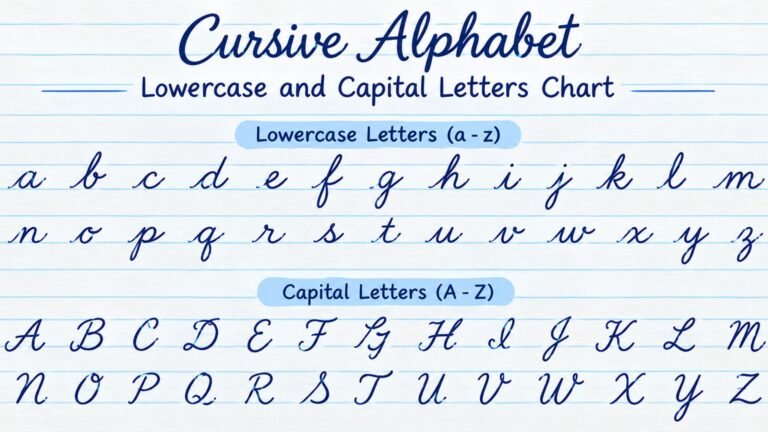
Capitals also change how the rest of the word is written. For the full connection rules, see the guide to cursive words and connecting letters, and for the lowercase letters that follow a capital, the cursive alphabet chart. If a capital Q keeps looking like a number 2, the guide to cursive numbers shows how the two differ.
See Your Capital Letters in Cursive Style First
Reading a description of 26 different letter shapes is a lot to hold in your head at once. Seeing them rendered cleanly in an actual script typeface makes the loops, humps and curves far easier to copy by hand.
Cursive Generator converts typed text, including full names and sentences, into genuine cursive-style characters and previews them across several real script fonts at once. Typing a name or a capitalized word is a fast way to see exactly how a capital letter should look before practicing it on paper.
Tips for Practicing Capital Cursive Letters
A short, focused practice routine works better than trying to drill all 26 capitals in one sitting.
- Practice one letter at a time rather than the whole alphabet at once. Capitals do not share strokes the way lowercase letters do, so grouped practice helps far less here than it does for lowercase letters.
- Start with the capitals in your own name and the words you write most often. Isolating practice on a single capital until it feels consistent, then adding another, beats spreading thin attention across all 26 at once.
- Practice the confusing pairs side by side. Write a row of capital I directly above a row of capital J, or a row of R above a row of N, so any drift toward looking alike becomes obvious immediately.
- Check your slant and height against nearby lowercase letters, not just against other capitals. A capital that leans differently from the lowercase letters around it stands out immediately, even when the capital’s own shape is correct.
Frequently Asked Questions
How do you write capital letters in cursive?
Start each capital as its own stroke rather than connecting directly from the letter before it, match the same slant used across the rest of the line, keep the height taller than lowercase letters without towering over them, and leave a small gap before connecting into the lowercase letters that follow.
Why do cursive capital letters look so different from print?
Cursive capitals come from copybook systems like Spencerian script and the Palmer Method, both of which prioritized continuous, flowing pen strokes over resemblance to printed type. Letters like capital I, R and Q kept their ornamental loops because those loops let the pen keep moving without lifting or doubling back.
Which cursive capital letters are hardest to learn?
Capital I and capital R are the two most frequently searched and most commonly confused cursive capitals, each covered in its own dedicated guide on this site. Capital Q also causes trouble because its closed loop and hooked tail closely resemble the numeral 2.
Do capital letters connect to the rest of the word in cursive?
Not the same way lowercase letters do. Most cursive styles treat a capital as its own independent stroke, finished before a small gap leads into the lowercase letters that follow, rather than one unbroken line running from the capital straight into the rest of the word.
Should I learn all 26 capital letters at once?
No. Capitals are better learned one at a time, since each one has its own specific shape rather than sharing strokes the way many lowercase letters do. Starting with the capitals in your own name is usually the most motivating and practical place to begin.
What is the easiest cursive capital letter to learn?
Letters that keep close to their print shape, such as capital X, capital O and capital C, tend to come fastest, since there is less of a gap between the printed version most people already know and the cursive version they are learning.
Are cursive capital letters the same in every font or handwriting style?
The general shape stays recognizable, but details vary by style. More ornamental scripts like Spencerian add larger loops and flourishes, while simplified modern cursive fonts, including the styles previewed on this site’s generator tool, keep the same basic structure with cleaner, less exaggerated strokes.
Conclusion
Capital cursive letters come down to patient, one-letter-at-a-time practice rather than trying to absorb all 26 shapes at once. Start each capital as its own stroke, match your slant, keep the height consistent with the lowercase letters around it, and leave a small gap before connecting into the rest of the word. Pay extra attention to the pairs that cause the most trouble, especially I and J, R and N, and Q and the numeral 2. Capital F, S, Z and J are covered alongside their lowercase forms in our guide to how to write F, S, Z and J in cursive. Capital G, K, A and N are covered in our guide to how to write G, K, A and N in cursive. Capital B, L, M and T are covered in our guide to how to write B, L, M and T in cursive. Capital H, E, P and D are covered in our guide to how to write H, E, P and D in cursive.
Once those habits are in place, capital letters stop being the part of cursive that trips you up and start reading as a natural part of the same handwriting. To see how a name or a capitalized word looks before writing it by hand, try Cursive Generator and preview it across several real script fonts.
7 Comments